> For the complete documentation index, see [llms.txt](https://help.tellius.com/llms.txt). Markdown versions of documentation pages are available by appending `.md` to page URLs; this page is available as [Markdown](https://help.tellius.com/vizpads-explore/actions-in-edit-mode/creating-a-new-vizpad.md).
# Creating a new Vizpad
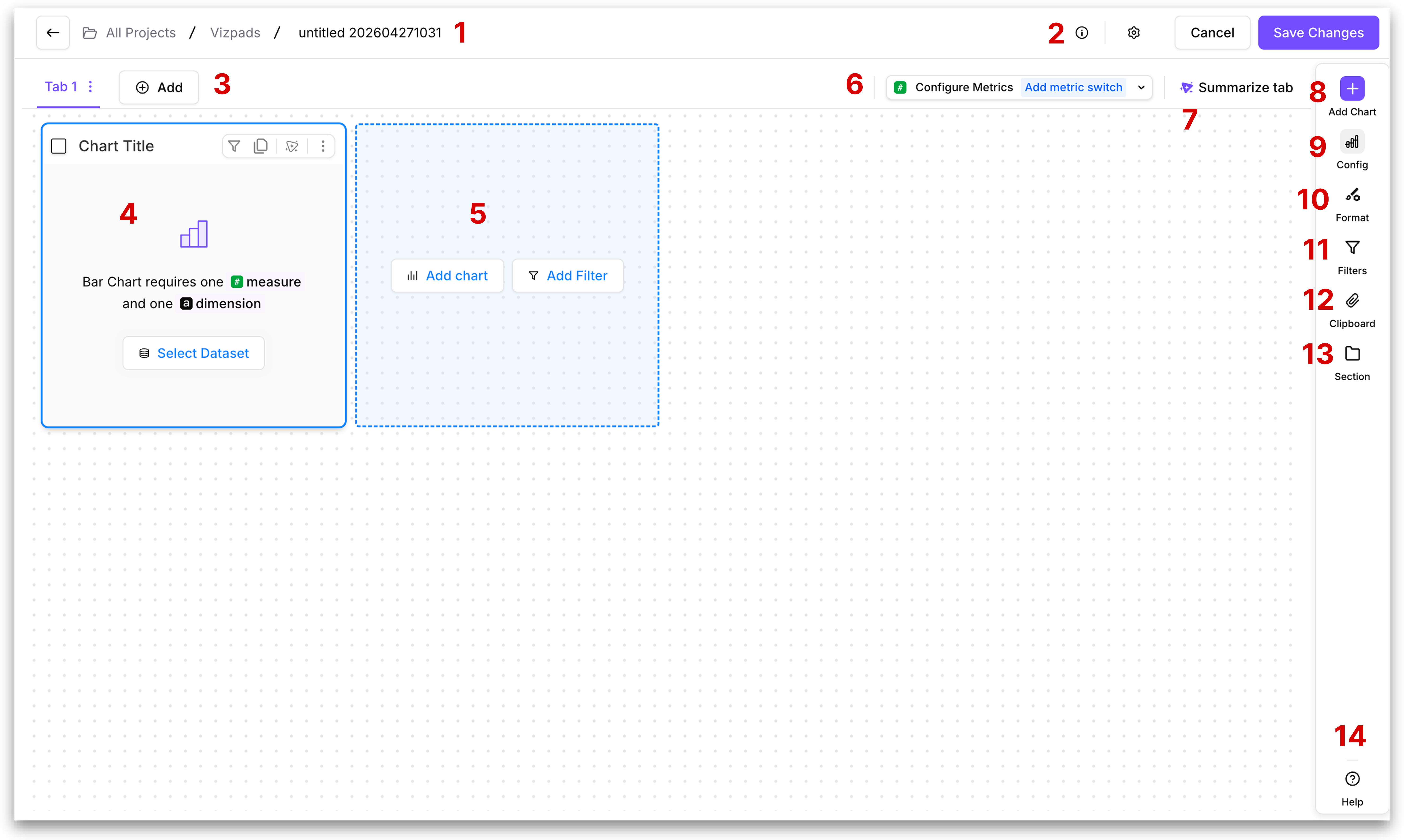
If you want to start fresh, you can create a new Vizpad from a blank canvas, where you can build charts, and customize your analysis from the ground up. Let's break down the components:
### **1. Vizpad name**
Displays the current location within the Vizpad as "**All Projects / Vizpads / \[Vizpad Name]**". To rename the Vizpad, click on the pencil icon adjacent to the Vizpad name (pencil icon appears when you hover over the name). Click on **←** to go back to the previous page that displayed all existed Vizpads.
{% hint style="warning" icon="floppy-disks" %}
Unsaved changes in a Vizpad will be lost if you navigate away before saving. Click on **Save Changes** button) to retain any edits made.
{% endhint %}
### **2. Edit mode toolbar**
The top-right corner of the edit mode canvas contains the controls that govern how you save, discard, and configure your Vizpad while editing. Three elements sit side by side:
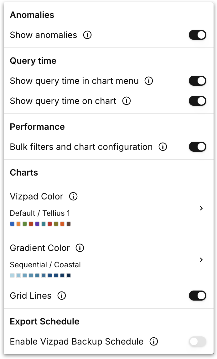
* **Settings (gear icon)** - Opens the Vizpad-level settings panel, where you can configure options such as anomalies, query time display, performance behavior, and export schedules.
#### Anomalies
**Show anomalies:** When enabled, Tellius highlights anomalous data points directly on the charts. Anomalies are detected by Tellius's built-in statistical models and surfaced inline so outliers stand out in the visualization. Anomalies are data points that deviate significantly from the standard data patterns and could indicate important insights or errors.
#### Query time
**Show query time in chart menu:** When enabled, the load time for each chart is displayed inside that chart's three-dot menu under **Time taken**. This is helpful when you're investigating performance of each chart.
**Show query time on chart:** When enabled, the query time is shown directly on the chart header next to its title so you can scan performance across the whole Vizpad at a glance.
#### Performance
**Bulk filters and chart configuration:** Controls when filter and configuration changes get actually pushed to the charts.
* **When disabled:** Every change you make is applied to the Vizpad instantly, and Tellius re-runs the affected queries immediately after each change.
* **When enabled:** Tellius batches your changes and waits for you to click **Apply** before pushing them to the canvas. Any changes you make are staged but not committed until you click **Apply**. So you can stack multiple filter additions, formatting tweaks, and configuration changes without triggering a single query. When you click **Apply**, all queued changes are committed and the affected charts re-render in one pass. Click **Revert** to discard the queued changes and return to the last committed state. This means you can experiment with multiple configuration changes simultaneously without triggering a re-query after each one.
{% hint style="success" %}
The **Apply** and **Revert** buttons occur only after you made any actions to the chart. Use bulk mode on dense Vizpads with many charts. Disable it for small Vizpads and quick edits.
{% endhint %}
#### **Charts**
These settings control the default visual appearance applied across all charts in the Vizpad.
* **Vizpad Color** - Sets the default color palette used to differentiate data categories across all charts in the Vizpad. Click to expand the palette picker, which works identically to the per-chart Chart colours option. Choose a **Category** from the dropdown (Default, Sequential, Diverging, Categorical, or Customized Diverging) and then select a palette from the available options. This can be overridden by individual chart color selection.
* **Gradient Color** - Sets the default gradient palette used for charts that represent continuous data changes, such as heatmaps or charts with sequential coloring. Click to expand the picker, choose a **Category**, and select a gradient palette. Clicking a palette reveals a **Reverse** button to flip the gradient direction. Charts that rely on gradient coloring will inherit this setting unless overridden individually.
* **Grid Lines:** Toggle grid lines on or off across all charts in the Vizpad. When enabled, every chart that supports grid lines (bar, line, combo, scatter, etc.) displays them by default. When disabled, charts render without grid lines for a cleaner look. Individual charts can still override this setting from their own **Format** panel under the Grid option.
* **Export Schedule:** Toggle **Enable Vizpad Backup Schedule** to set up a recurring export of the entire Vizpad. Once enabled, you can configure the frequency, format, and recipients for automated snapshots of the Vizpad, delivered on a fixed cadence. Use this to receive regular updates or to maintain an archive of Vizpad states over time.
{% hint style="info" %}
The schedule for Vizpad backup can be set up under **Settings → Application Settings → Vizpad Export Schedule.**

{% endhint %}
#### Saving a Vizpad
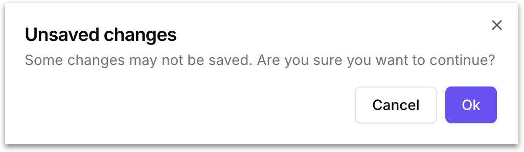
* **Cancel** - Exits edit mode and returns you to **View** mode. If you have unsaved changes, Tellius displays a confirmation prompt asking whether you want to leave without saving. This ensures you never lose work by accidentally clicking away.
* **Save Changes** - Commits every change you've made during the current edit session to the Vizpad in a single save. Until you click **Save Changes**, nothing you've done in edit mode is persisted. Once saved, the changes become the new state of the Vizpad.
### **3. Tabs**
Tabs let you organize a Vizpad into multiple pages, so you can group related charts together. For example, you might dedicate one tab to revenue metrics, another to operational KPIs, and a third to regional breakdowns, all within the same Vizpad.
Each tab is displayed as a clickable label. Click any tab to switch to its canvas. The currently active tab is highlighted. To add a new tab, click the **+ Add** button. The new tab opens with a blank canvas.
Each tab has a **three-dot menu** next to its name. Click it to access:
* **Rename:** Change the tab's display name.
* **Clone:** Duplicate the entire tab, including all of its charts, configurations, filters, and formatting.
{% hint style="warning" %}
A Vizpad can have a maximum of **10 tabs**.\
\
Each tab supports up to **25 standard charts** (bar, line, pie, combo, scatter, etc.). **KPI charts, text objects, and table visualizations** do not count toward this limit. If a tab already contains 25 standard charts, Tellius will prevent you from adding another standard chart or converting a KPI into a standard chart, since doing so would exceed the cap.
{% endhint %}
### **4. New chart added**
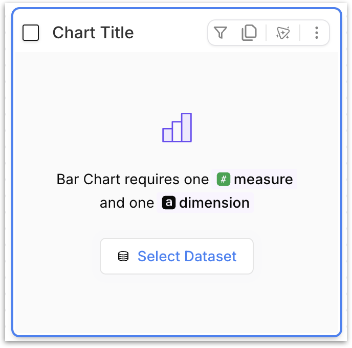
Click the **Add chart** button (part 8 in the image) to include various chart types in a Vizpad. When you add a new chart to the canvas, it displays the selected chart type's icon, its name, and the **minimum requirements** for that chart type. This tells you exactly what columns you need to drag in before the chart can render.
At the center of the placeholder, a **Select Dataset** link glows and remains highlighted until you select a Business View. This is the **mandatory first step**; no chart can render until a dataset (Business View) is selected.
Clicking **Select Dataset** opens the Business View browser in the **Config** panel (part 9 in the image), where you can pick the dataset and begin dragging columns into the Measure, Dimension, and other configuration fields. Once a dataset is selected, the minimum column requirements are met, and the changes are applied, the placeholder is replaced by a live chart.
{% hint style="warning" %}
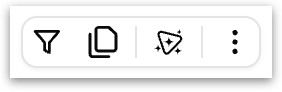
The placeholder also includes the standard chart-level action icons in its top-right corner (filter, clone, Kaiya summary, and three-dot menu) but these become functional only after the chart has data to work with
{% endhint %}
A **checkbox** in the top-left corner lets you select the chart for bulk operations like moving it into a section (part 13 in the image).
{% hint style="success" icon="input-text" %}
The chart title updates automatically as you build the chart. Each time you drag a column into a configuration field or apply a filter, Tellius regenerates the title to reflect the current state of the chart. There is no need to type a title manually, though you can always override the auto-generated title with a custom one by hoverign over the title and clicking on the pencil icon.
{% endhint %}
#### Working with Business Views in a Vizpad
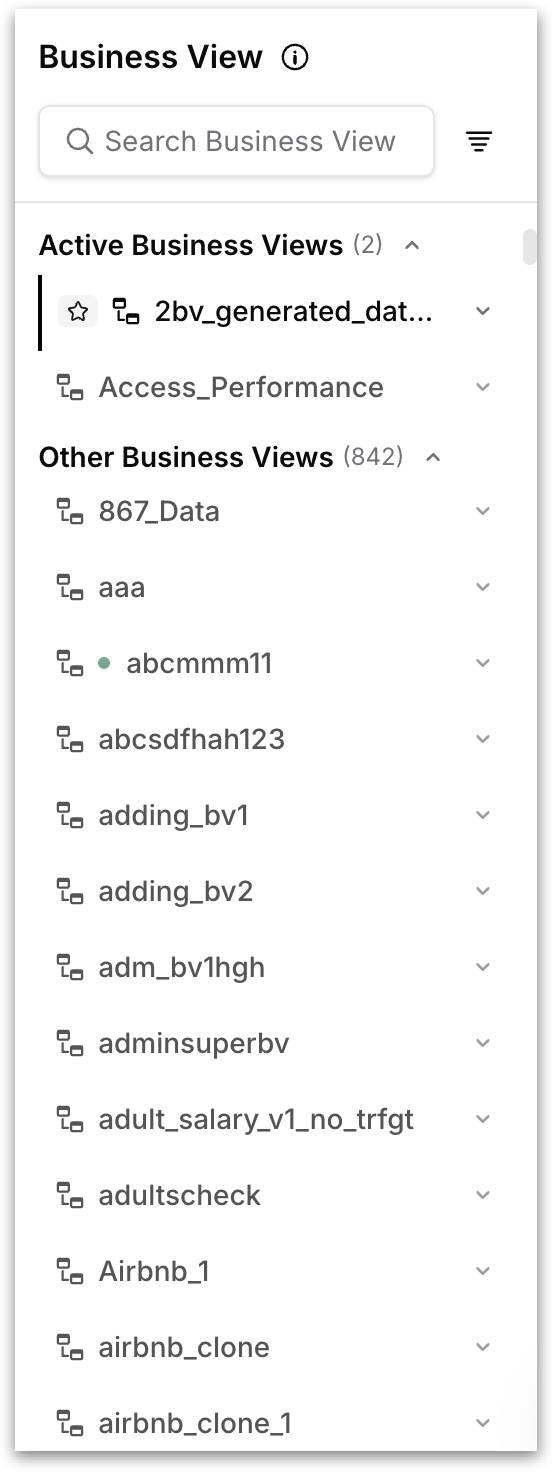
The Business View panel lists every Business View available on your instance, grouped into two sections:
**Active Business Views** are the BVs currently in use by at least one chart in the Vizpad. The BV used by the chart you have selected is marked with a ⭐ star next to its name; this is the chart's underlying BV.
**Other Business Views** lists every BV that isn't being used by any chart in the Vizpad yet. You can pick any BV from this section to build a new chart from.
A few things to know about how this works:
* A chart uses one Business View. Each chart in a Vizpad is built from a single underlying BV. You can't combine two BVs into one chart.
* A Vizpad (and a tab) can have multiple Business Views. Charts from different BVs can sit side by side on the same tab.
* Global and tab filters span Business Views via common columns. If two BVs share a column with the same name (for example, both have a `revenue` column), applying a global filter on that column affects every chart that uses either BV. Columns common across BVs are marked with a Venn diagram-like icon in the filter dropdown.
* No soft links needed. Multi-BV Vizpads work without any setup at the BV level. This is different from multi-BV in Kaiya, which uses soft links between BVs to answer questions that span multiple BVs in a single conversation.
#### **Chart-level actions after configuring the chart**
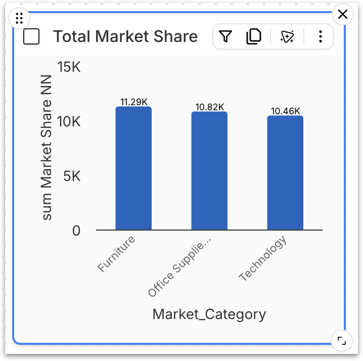
Hovering over any chart on the canvas reveals a row of icons in the chart's top-right corner.
* **Filter:** Click the funnel icon to add a **chart-level filter** that applies only to this single chart. This is scoped to one chart. Please check out the **Chart Filters** section in [this](/vizpads-explore/actions-in-view-mode/filters.md) page. Once a filter is added, clicking on the **Filter** icon again will show/hide the applied filters. To add more filter(s), click on **+** at the end of the filter pills.
Alternatively, you can also add chart-level filters from the **Filters** in the right pane.
{% hint style="info" %}
To apply a filter to the chart, after selecting the filter, click on the **Apply** button in the top bar to commit the changes. If a filter is still in a pending state without commit, a small blue icon will displayed in the top right of the filter pill.
{% endhint %}
* **Clone:** Click on **Clone** to duplicate the chart. This creates an exact replica within the same Vizpad tab, preserving all filters and settings.
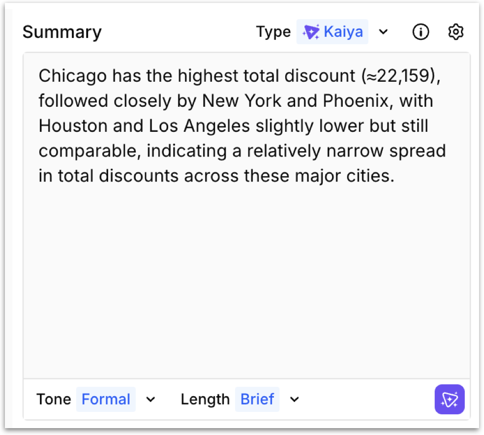
* The **Add Kaiya summary** button generates an AI-powered natural language summary of the selected chart's data. You get a plain-English narrative that highlights the key takeaways, written by Kaiya, Tellius's AI engine.
The summary panel appears alongside the chart, depending on your display settings. At the top of the panel, a **settings gear** provide access to configuration. A dropdown menu lets you control how the summary is generated.
* **Kaiya:** Tellius's built-in AI generates the summary automatically based on the chart's data, measures, dimensions, and applied filters. This is the default and requires no manual input.
* **Custom:** Write your own summary text instead of using AI-generated content.
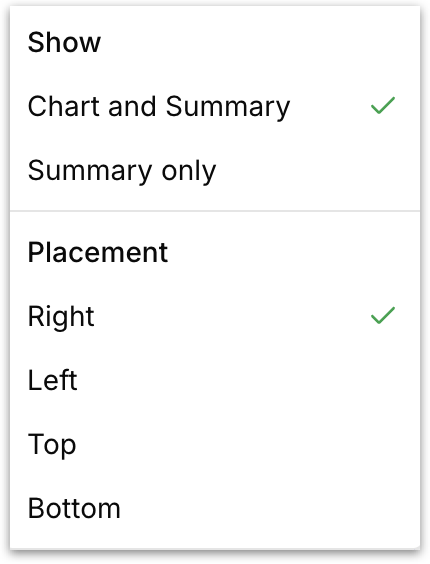
Click on the gear icon and the following menu gets displayed:
**Show:** Control how the summary appears in the chart tile:
* **Chart and Summary -** Displays the chart and the summary side by side within the same tile.
* **Summary only** - Hides the chart entirely and displays only the summary text. For example, a KPI tile where the headline number and its context are more useful than the chart itself.
**Placement:** Choose where the summary sits (right, left, top, bottom) relative to the chart (applies only when *Chart and Summary* is selected).
**Tone:** Control the writing style of the Kaiya-generated summary:
* **Formal -** Professional, report-ready language suited for external presentations.
* **Casual -** Conversational, approachable language suited for day-to-day exploration.
* **Neutral -** Balanced tone that sits between formal and casual, keeping the language clear without being overly stiff or relaxed.
**Length:** Control how much detail Kaiya includes:
* **Brief -** A few sentences covering only the most important takeaway.
* **Moderate** - A short paragraph that adds supporting comparisons and context beyond the headline insight.
* **Detailed** - A thorough narrative covering all major patterns, comparisons, and outliers in the data.
Click the **Kaiya icon** at the bottom-right to regenerate the summary with your current tone and length settings.
{% hint style="success" icon="list-radio" %}
The summary regenerates automatically whenever the chart's underlying data changes (for example, when filters are applied or the metric is switched). You can also manually regenerate it by clicking the Kaiya icon at the bottom-right of the summary panel.
{% endhint %}
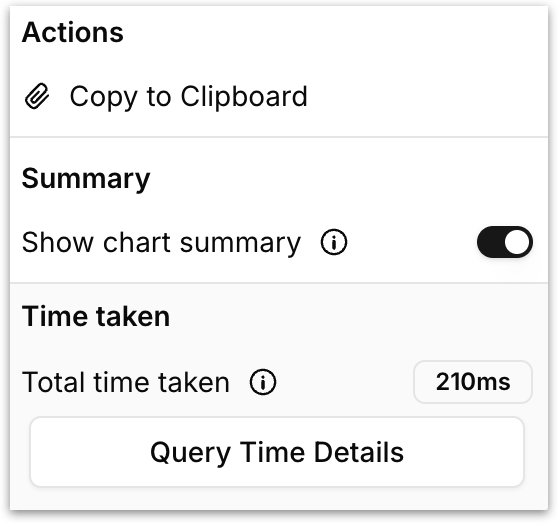
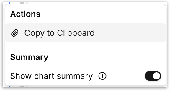
* **Three-dot chart menu:** Clicking the three-dot menu on any chart opens the following panel:
**Copy to Clipboard:** This option lets you duplicate a chart or table across tabs or Vizpads. Check out [this](/vizpads-explore/actions-in-edit-mode/copy-to-clipboard.md) page.
{% hint style="info" %} **Clone vs Copy to Clipboard**
* **Clone**: Instantly duplicates the chart or table **within the same tab**. The copy appears directly below the original and includes all formatting, filters, and settings.
* **Copy to Clipboard**: Saves the chart or table **to your clipboard**, including all associated settings. You can then **navigate to any other tab or Vizpad (in Edit mode)** and paste it there. This is ideal for reusing charts across different views or projects. The copied item remains in the clipboard until your session ends or you copy something else.
{% endhint %}
**Show chart summary:** When enabled, Kaiya generates a chart summary that appears alongside the chart, which can be customized as needed.
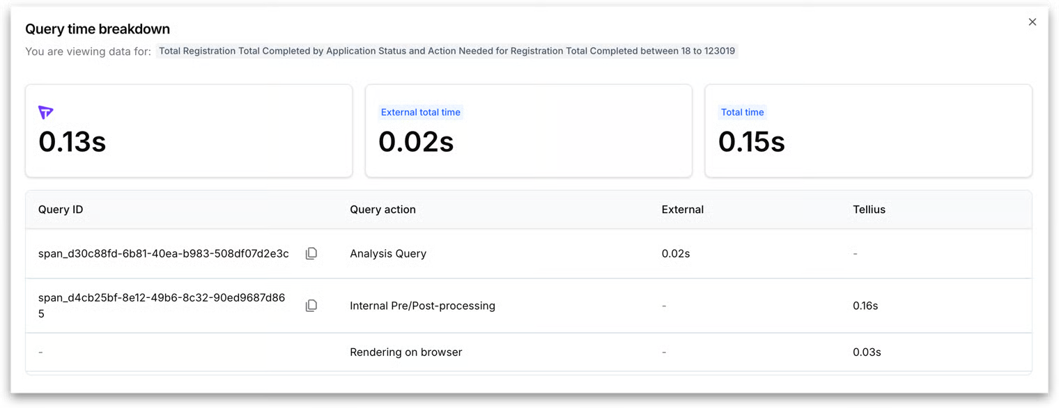
**Total time taken:** It displays the time taken by Tellius and other external engines to load the individual chart. Click on **Query time details** to view the complete breakdown. Displays Tellius engine time, external engine time, network, and rendering. Use this when you're investigating the performance of a chart.
#### Resizing, repositioning, and deleting a chart
**Reposition:** Click on the six dot icon in the top left to move the chart across the canvas.
**Delete:** Click on the **"x"** in the top right corner to delete the chart.
**Expand / Collapse:** Click the diagonal-arrows icon in the bottom right and drag to enlarge/minimize the chart as required.
### **5. The empty chart slot**
The dashed-border area next to an existing chart is an **empty chart slot**. It offers two quick-start actions:
* **Add chart:** Adds a new chart in that slot, identical to the one described above. This is an alternative to using the **Add Chart** button in the right pane.
* **Add Filter:** Opens the **Filters** panel with a new filter ready to configure.
### **6. Configure metrics for switch metric**
Switch Metric lets you replace a chart’s current measure with another measure.
This is where you define which measures are available for viewers to switch between in View mode using the **Switch Metric** dropdown.
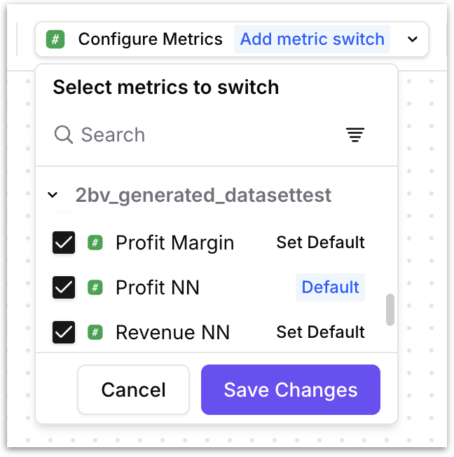
Click **Add metric switch** to open the metric configuration panel. The panel lists every measure column available from the Vizpad's active Business View(s), grouped by Business View name. Use the search bar and filter icon to find columns quickly.
* To make a measure available for switching, check the box next to it. You can select as many measures as you need.
* To remove it from the list, uncheck it.
* One measure must be designated as the **Default**. The default is the measure the chart primarliy loads when opened. It's the baseline state that viewers see before they switch to anything else. To set a default, click **Set Default** next to the desired measure.
* Only one measure can be the default at any time; setting a new default automatically removes the tag from the previous one.
* When you're done, click **Save Changes** to persist your configuration, or **Cancel** to discard.
{% hint style="warning" icon="link-simple" %} **How this connects to view mode:** The measures you check here are exactly the ones that appear in the **Switch Metric** dropdown in view mode. The measure you mark as **Default** is the one pre-selected when the Vizpad opens. If a viewer picks a different measure, every chart that uses the default measure re-renders with the new one-- filters, dimensions, formatting, and chart types are all preserved. When the viewer closes the Vizpad or reverts, the Vizpad reverts to the default measure.
{% endhint %}
{% hint style="danger" %}
If you don't configure any metrics here, the **Switch Metric** dropdown will not appear in view mode at all. Metric changes made via **Switch Metric** are not saved to a **Custom View**. They apply for the duration of your session and reset when you close the Vizpad.
{% endhint %}
### **7. Summarize tab**
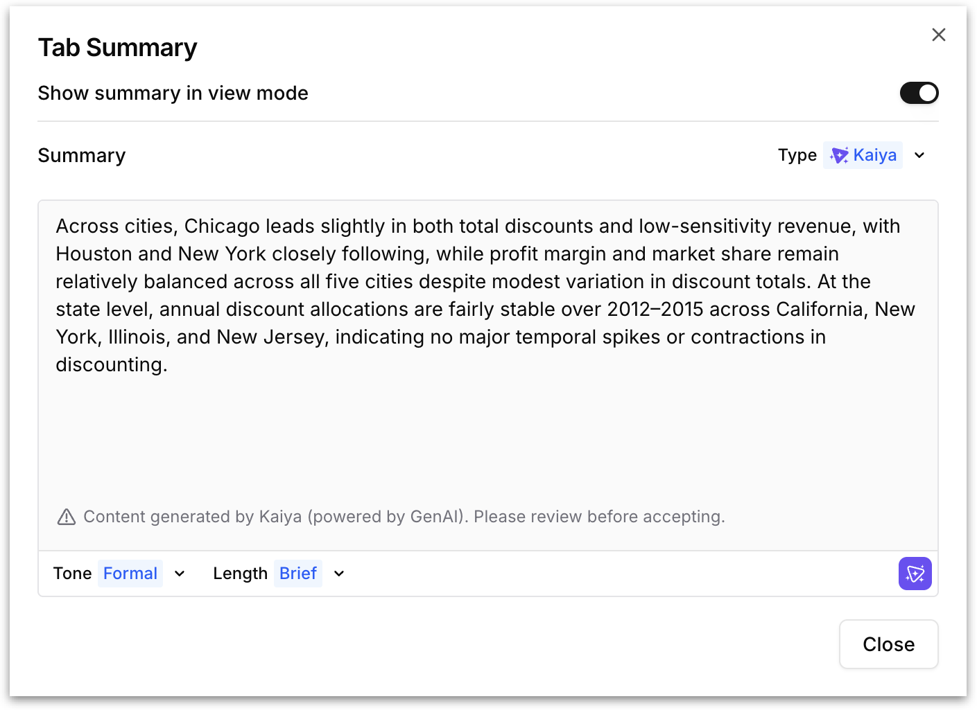
While the per-chart summary described earlier generates a narrative for a single chart, **Summarize tab** generates an AI-powered summary of the entire active tab. Kaiya reads every chart and table on the tab and produces a unified narrative that ties together the key insights across all of them.
Click the button to open the **Tab Summary** dialog.
* **Show summary in view mode:** Toggle this on to make the tab summary visible to viewers when they open the Vizpad in view mode. When off, the summary exists only in edit mode.
* **Type:** Choose the summary engine:
* **Kaiya:** Tellius's AI engine analyzes all charts on the tab and generates a cohesive narrative automatically.
* **Custom:** Write your own tab-level summary instead of using Kaiya.
* **Tone:** Control the writing style: *Formal*, *Casual*, or *Neutral*. Works identically to the per-chart summary tone setting.
* **Length:** Control the detail level: *Brief*, *Moderate*, or *Detailed*. Works identically to the per-chart summary length setting.
The generated summary appears in the text area and can be reviewed before accepting. Click the **Kaiya icon** at the bottom-right to regenerate the summary with your current tone and length settings. Click **Close** to dismiss the dialog.
{% hint style="success" %}
The tab summary regenerates when the underlying data changes. For example, when filters are applied or charts are added or removed from the tab.
{% endhint %}
### 8. Add Chart
The **Add Chart** panel lets you browse and select which chart type to place on the canvas.
* For a detailed explanation of what each chart type is and when to use it, see [Understanding Tellius charts](https://help.tellius.com/search/know-your-charts-in-tellius/understanding-tellius-charts).
* To understand the different variants available within a chart type (for example, vertical vs. horizontal bar, line vs. area, pie vs. donut), see [Variations of a chart type](https://help.tellius.com/search/know-your-charts-in-tellius/variations-of-a-chart-type).
* To check the minimum number of measures and dimensions each chart type requires before it can render, see [Requirements of charts](https://help.tellius.com/search/know-your-charts-in-tellius/requirements-of-charts). These requirements are also shown inline when you hover over any chart type in the **Add Chart** panel.
### 9. Config
The Config panel is where you build, configure, and refine the chart after adding it to the canvas.
* For a breakdown of every configuration field (Measure, Dimension, Color By, Sort By, Tooltip, Unused, Pagination, and more), see [Building charts from Configuration pane](https://help.tellius.com/search/know-your-charts-in-tellius/building-charts-from-configuration-pane).
* For fields that are unique to specific chart types and not covered in the general guide, see [List of chart-specific fields](https://help.tellius.com/search/know-your-charts-in-tellius/list-of-chart-specific-fields).
* For how to drag columns from the Business View browser into configuration fields, see [Adding columns to fields in Configuration pane](https://help.tellius.com/search/know-your-charts-in-tellius/adding-columns-to-fields-in-configuration-pane).
* For aggregation options like absolute change and percentage change, see [Absolute and percentage change aggregations](https://help.tellius.com/search/know-your-charts-in-tellius/absolute-and-percentage-change-aggregations).
* To switch an existing chart to a different chart type from the Config panel, see [Switching to another chart](https://help.tellius.com/search/know-your-charts-in-tellius/switching-to-another-chart).
* For trend lines, forecasting, and other analytical overlays, see [Advanced analytics](https://help.tellius.com/search/know-your-charts-in-tellius/advanced-analytics).
* For building a cumulative line chart specifically, see [Cumulative line chart](https://help.tellius.com/search/know-your-charts-in-tellius/cumulative-line-chart).
### 10. Format
The Format panel in edit mode is identical to the one available in view mode. The same chart formatting options (Title, Background, Chart colours, Number Formatting, Data Labels, Axis Labels, Grid, Legends, Conditional Formatting, Summary, Benchmark) and the same table formatting options (Text formatting, Column, Values alignment, Pinned columns) are available with the same controls and behavior. For full documentation, see [Formatting charts in View mode](https://help.tellius.com/vizpads-explore/actions-in-view-mode/formatting).
### 11. Filters
The Filters panel in edit mode is identical to the one available in view mode. The same four-tier hierarchy (Global filters → Tab filters → Section filters → Chart filters) with the same filter builder workflow. The only difference is that filters added in edit mode are saved directly to the Vizpad when you click **Save Changes**, whereas filters added in view mode require saving to a **Custom View** to persist. For full documentation, see [Applying Filters in View mode](https://help.tellius.com/vizpads-explore/actions-in-view-mode/filters).
### 12. Clipboard
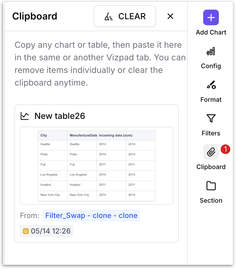
The **Clipboard** panel acts as a temporary holding area for charts and tables. Copy a chart once, and it's available to paste into any tab in the current Vizpad or into a different Vizpad entirely, with all of its configuration, formatting, filters, and data bindings intact.
#### How to copy a chart to the clipboard?
Hover over any chart on the canvas, click the three-dot menu, and select **Copy to Clipboard**.
The chart is immediately added to the clipboard. A red badge with a count appears on the **Clipboard** icon in the right rail so you can see at a glance how many items are stored.
Open the Clipboard panel to see every chart you've copied. Each item is displayed as a mini preview thumbnail with the date and time it was copied.
#### Pasting a chart from the clipboard
To paste a clipboard item onto the canvas, click the item in the **Clipboard** panel or drag and drop into the canvas. The chart is placed on the active tab as a new chart tile, preserving its full configuration — chart type, measures, dimensions, filters, formatting, and the Business View it's connected to. You can paste the same chart multiple times (into different tabs or Vizpads) without removing it from the clipboard.
#### Removing the clipboard items
* Each clipboard card has a remove action to delete that single item from the clipboard.
* Click the **CLEAR** button at the top of the **Clipboard** panel to empty the clipboard entirely.
{% hint style="danger" %}
The clipboard persists for the duration of your session. If you close the browser or log out, the clipboard is cleared.
{% endhint %}
### 13. Sections
The **Section** panel lets you group related charts together on the canvas into named containers. Once charts are grouped into a section, you can apply **section-level filters** that affect only the charts inside that section (a scope narrower than a tab filter but broader than a chart filter).
#### When to use sections
Sections are most valuable on dense Vizpads where a single tab covers multiple aspects of a business area.
For example, a supply chain tab might have five charts about inbound logistics and five about outbound logistics. With sections, you can group the inbound charts into one section and the outbound charts into another, then apply filters independently to each group. Sections are also useful for visual organization.
#### How to create a section
There are two ways to create a section:
**Method 1: From the Section panel:**
1. Select one or more charts on the canvas by clicking the **checkbox** in the top-left corner of each chart. Each selected chart gets a checkmark.
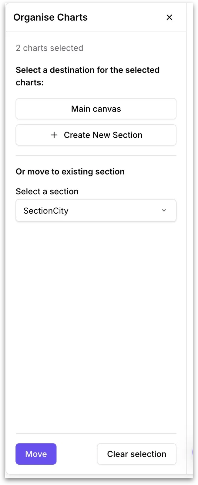
2. Click the **Section** icon in the right rail. The **Organise Charts** panel opens, showing the number of charts you've selected.
3. The **Organise Charts** panel appears whenever you open the Section panel with one or more charts selected
* **Main canvas:** Moves the selected charts out of any section and back onto the main (ungrouped) canvas. Use this when you want to un-section charts.
* **Create New Section:** Creates a brand-new section and moves the selected charts into it in one step.
* **Or move to existing section:** Lists every section that already exists on the current tab. Pick one, and the selected charts are moved into that section.
4. After choosing a destination, click **Move** to commit the action. Click **Clear selection** to deselect all charts and dismiss the panel without making any changes.
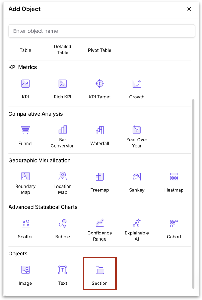
**Method 2: From the Add Object panel:**
1. Click **Add Chart** in the right pane.
2. Scroll to the **Objects** category at the bottom and click **Section**.
3. An empty section container with new chart placeholder is added to the canvas. You can also move charts into the section.
{% hint style="info" %}
Once a section exists, a **Section filters** tier appears in the Filters panel (between Tab filters and Chart filters). Section filters apply only to the charts inside the section they're associated with. Check out [this](https://help.tellius.com/vizpads-explore/actions-in-view-mode/filters) page for more info.
{% endhint %}
### 14. Help
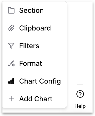
The **Help** icon sits at the bottom of the right pane. Clicking it launches a guided tour of the edit mode interface: a step-by-step tooltip walkthrough that highlights each section in the right pane.
The tour walks through each section, spotlighting each icon and displaying a tooltip that briefly explains what the panel does.
Each tooltip has two options: click **NEXT** to advance to the next panel in the tour, or click **Skip** to dismiss the tour entirely. The tour is available on demand; click **Help** any time you need a quick refresher without leaving the canvas.
---
# Agent Instructions
This documentation is published with GitBook. GitBook is the documentation platform designed so that both humans and AI agents can read, navigate, and reason over technical content effectively. Learn more at gitbook.com.
## Querying This Documentation
If you need additional information that is not directly available in this page, you can query the documentation by asking a question.
Perform an HTTP GET request on the following URL with the `ask` and `goal` query parameters:
```
GET https://help.tellius.com/vizpads-explore/actions-in-edit-mode/creating-a-new-vizpad.md?ask=&goal=
```
`ask` is the immediate question: it should be specific, self-contained, and written in natural language.
`goal` is what the user is ultimately trying to achieve, the reason they need the answer. Sharing it helps GitBook give you a better, more relevant answer. A goal is most helpful when it describes the outcome the user wants rather than restating the question. For example, with `ask=how do I create an API token`, a goal like `automate deployments from our CI pipeline` lets GitBook tailor the answer to that use case.
The response will contain a direct answer to the question and relevant excerpts and sources from the documentation.
Use this mechanism when the answer is not explicitly present in the current page, you need clarification or additional context, or you want to retrieve related documentation sections.