> For the complete documentation index, see [llms.txt](https://help.tellius.com/llms.txt). Markdown versions of documentation pages are available by appending `.md` to page URLs; this page is available as [Markdown](https://help.tellius.com/vizpads-explore/actions-in-view-mode/formatting.md).
# Formatting
## Chart Formatting
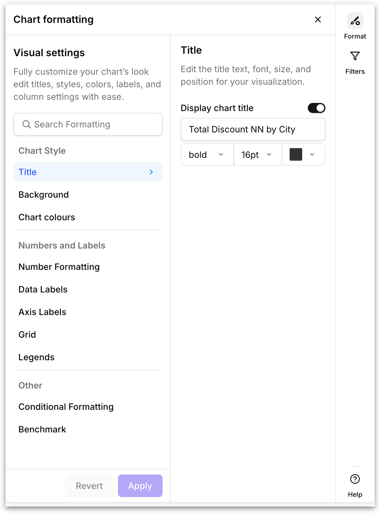
Select a chart on the Vizpad, then click **Format** in the right rail to open the **Chart formatting panel**. The panel is organized into three groups: **Chart Style, Numbers and Labels**, and **Other**. Hovering over any option reveals a short description of what each option controls. At the bottom of the panel, **Apply** commits your changes to the chart and **Revert** undoes them. A search bar at the top of the panel lets you jump straight to a setting by name.
{% hint style="warning" icon="eye" %}
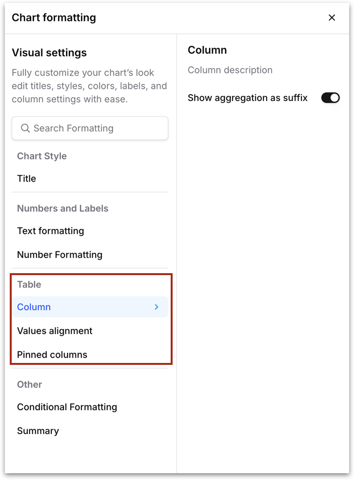
The formatting options shown in the panel are context-sensitive. They change depending on the type of chart or table you have selected. For example, a table (standard, pivot, or detailed) will show table-specific options like **Text formatting, Column settings, Values alignment**, and **Pinned columns**. The sections below cover both chart formatting and table formatting.
{% endhint %}
### **Chart Style**
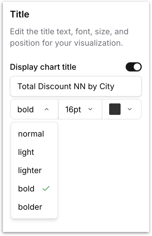
* **Title**: Edit the title text, font weight, font size, and color of your chart. Toggle **Display chart title** off to hide the title entirely.
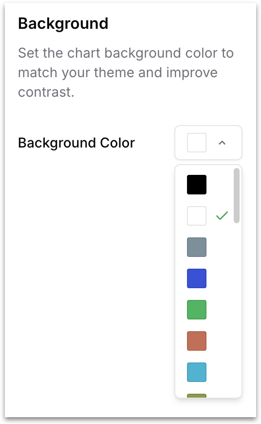
* **Background**: Set the chart background color so it matches the surrounding theme/ your branding theme or improves contrast against the canvas.
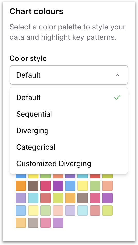
* **Chart colours:** Control the color palette used to render your chart's data series. The Color style dropdown determines the type of palette, and each style surfaces a different set of named palettes to choose from under Select colour palette. The five color styles serve different analytical purposes:
* **Default**: A general-purpose multi-hue palette designed to work across most chart types. Use Default when your chart has unrelated categories that don't carry an inherent order or direction.
* **Sequential**: A single-hue gradient that progresses from light to dark. Sequential palettes are designed for data that has a natural low-to-high ordering, such as revenue bands, population density, or intensity scores.
* **Diverging**: A two-tone gradient that moves from one color through a neutral midpoint to a contrasting color. Sesigned for data that has a meaningful center point (such as profit vs. loss, above vs. below target, or positive vs. negative sentiment).
* **Categorical**: A high-contrast multi-hue palette optimized for charts with many distinct categories. Use **Categorical** when your chart has a large number of unrelated groups (such as product SKUs, department names, or region codes) and you need every group to stand out clearly.
{% hint style="info" %}
When you click on a palette to select it, the expanded view shows a **Reverse** button in the top-right corner. Clicking **Reverse** flips the order of colors in the palette (for example, a Sequential palette that normally runs light-to-dark will run dark-to-light instead).
{% endhint %}
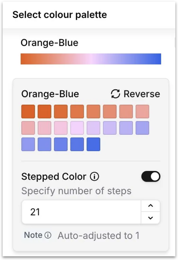
* **Customized Diverging:** A continuous gradient rendered as a smooth color ramp. Works similarly to **Diverging** but produce smoother transitions, making them well suited for heatmaps, and any chart where values are distributed across a wide continuous range and you want the color transition to feel gradual rather than stepped.
{% hint style="info" icon="stairs" %}
When you select a **Customized Diverging** palette, the expanded view includes a **Stepped Color** toggle. When enabled, Tellius converts the smooth continuous gradient into a fixed number of discrete color steps, and a **number of steps** field appears below the toggle so you can specify exactly how many steps to use. Use stepped color when you want clear visual boundaries between value ranges (such as bins in a heatmap) rather than a smooth blend where differences between adjacent values can be hard to perceive.
{% endhint %}
After selecting a color style, scroll through the available palettes and select one to apply it on your chart.
### **Numbers and Labels**
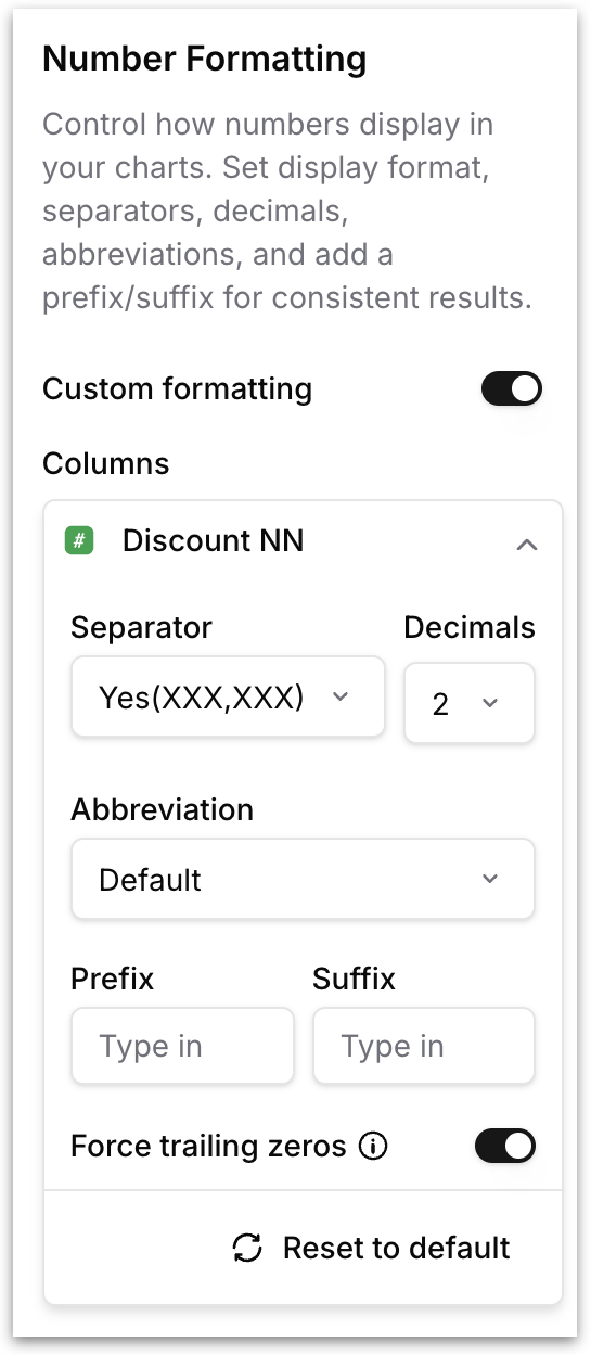
* **Number Formatting:** Control how numeric values are displayed. Toggle **Custom formatting** to override the default for one or more measure columns, then configure the
* Separator (for example, (XXX,XXX) for thousands separators)
* Decimals (number of decimal places)
* Abbreviation (Default, K, M, B)
* Prefix (for example, $ for currency)
* Suffix (for example, % for percentages).
* **Force trailing zeros** toggle ensures values like 4.5 display as 4.50 when your decimal setting is 2.
* Click **Reset to default** to clear all custom formatting and fall back to the chart's native behavior.
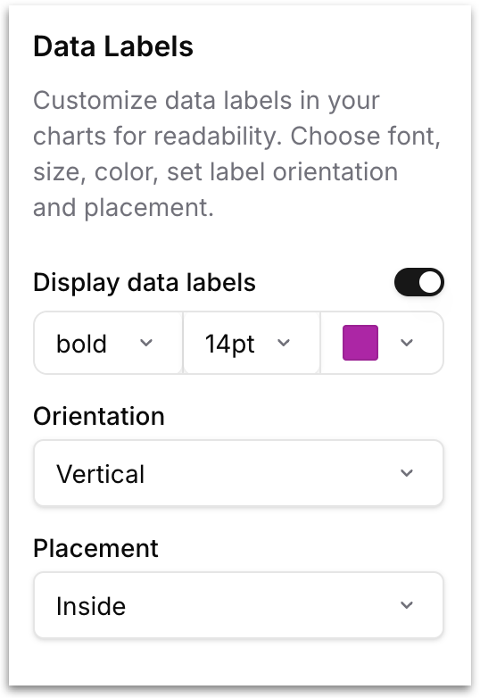
* **Data Labels:** Customize the inline labels that appear on each data point. Toggle **Display data labels** to show or hide them, then configure font weight, size, and color, and choose an **Orientation** (Horizontal, Vertical) and **Placement** (Inside, Outside) so labels stay readable on dense charts.
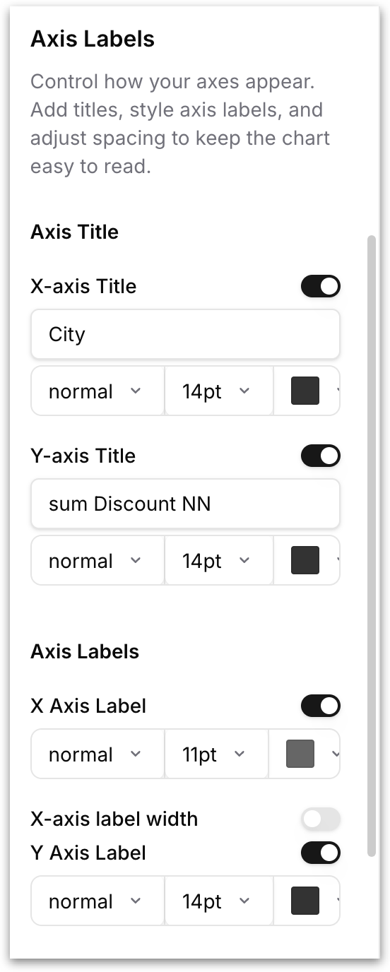
* **Axis Labels:** Control how the chart's axes are titled and labeled. Below the titles, the **Axis Labels** section controls the per-tick labels along each axis with their own font and color settings
* Toggle **X-axis Title** to show or hide the horizontal axis title, and **Y-axis Title** to show or hide the vertical axis title.
* For each, you can edit the title text directly in the input field, and set the font weight, font size, and color.
* Toggle **X Axis Label** to show or hide the tick labels on the horizontal axis, then set the font weight, font size, and color.
* The **X-axis label width** toggle, when enabled, lets you cap how much horizontal space each tick label is allowed to occupy. This is useful when your X axis has long category names that would otherwise overlap each other or push into neighboring labels.
* **Y Axis Label** works the same way for the vertical axis, with its own font weight, font size, color controls and Y-axis label width.
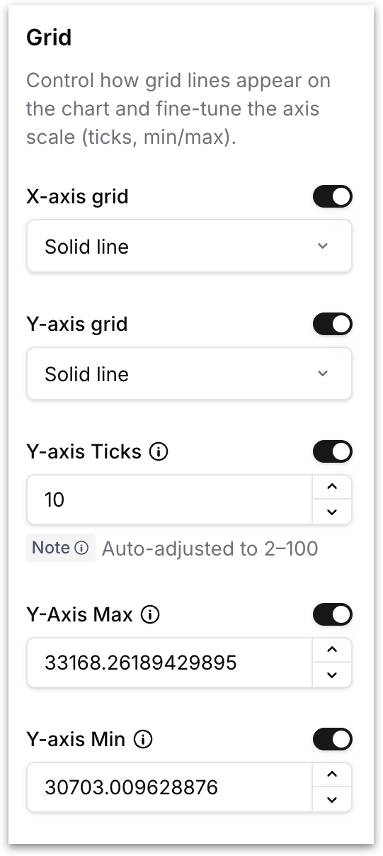
* **Grid:** Control the appearance of grid lines and the scale of the chart's axes.
* Toggle **X-axis grid** and **Y-axis grid** independently, and pick a line style (Solid line, Dashed) for each.
* **Y-axis Ticks** sets the number of tick marks on the Y axis (auto-clamped to 2-100), and **Y-axis Max / Y-axis Min** let you fix the upper and lower bounds of the axis instead of letting Tellius auto-scale. Useful when you want a consistent scale across multiple charts.
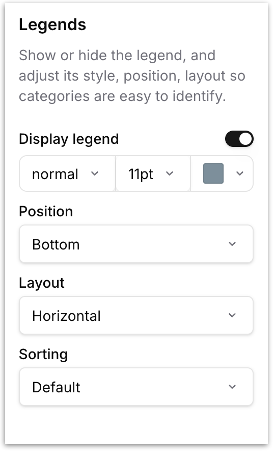
* **Legends:** Show or hide the chart legend and control how it looks and where it sits. Toggle **Display legend** to turn the legend on or off.
* Set the font weight (normal, bold), font size, and text color of the legend labels.
* **Position:** Choose where the legend is placed relative to the chart: *Top*, *Bottom*, *Left*, or *Right*.
* **Layout:** Choose *Horizontal* to arrange legend items side by side in a row, or *Vertical* to stack them one per line.
* **Sorting:** Control the order in which legend items appear. *Default* preserves the order determined by the data. You can also sort legend items ascending/descending so the legend matches the visual hierarchy of the chart.
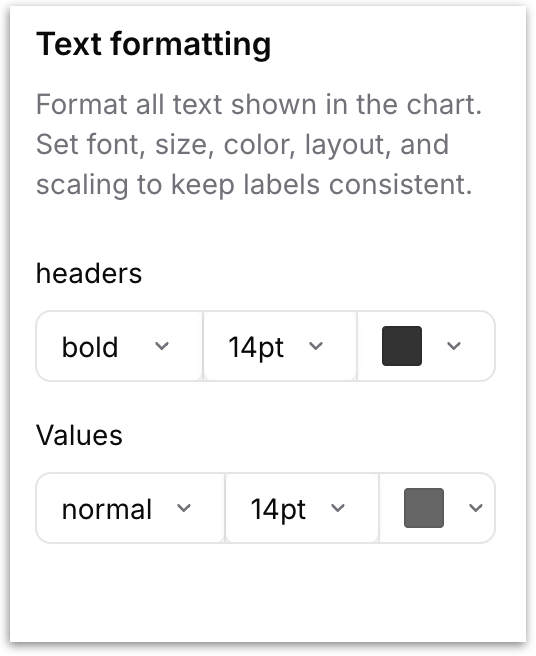
**Text formatting ****(only for tables and detailed tables)****:** Controls the typography of all text displayed inside the table. Two separate sets of controls let you style **headers** and **values** independently. For each, set the font weight (normal, bold), font size, and text color.
### **Other**
#### Conditional Formatting
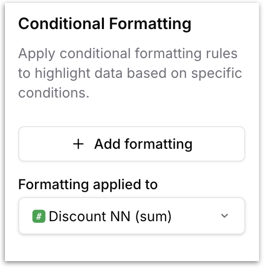
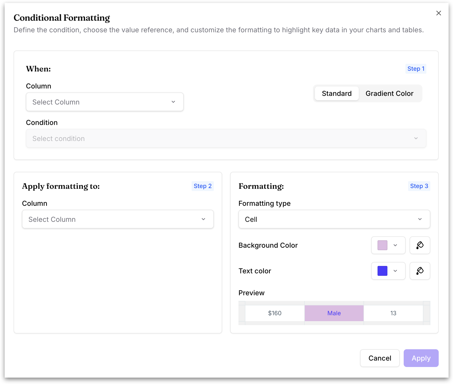
Apply rules that highlight data based on conditions (for example, color any bar where Registration Total Completed is greater than or equal to 100). Click **Add formatting** button to open the following rule builder:
The rule builder offers two modes, selected using the **Standard** / **Gradient Color** toggle in the top right.
* **Standard** applies a single fixed format when a condition is met, and is described below.
* **Gradient Color** shades values across a color range instead of using a fixed threshold, and is described in the next section. This option is available for tables, detail tables, and pivot tables.
{% hint style="info" %}
Choose **Standard** when you want to flag values that meet a specific condition — everything crossing the threshold gets the same color, so exceptions stand out.\
\
Choose **Gradient Color** when you want to compare values across the whole table — each value is shaded by where it falls between the minimum and maximum, showing relative magnitude rather than pass/fail.
{% endhint %}
### **STANDARD**
**Step 1: When**
* **Column:** Pick the column to evaluate. For numeric columns, Tellius shows the current **Min** and **Max** as a hint so you can choose a relevant threshold.
* **Condition:** Choose the comparison to apply (for example, Greater than, Less than, Equal to). This field becomes active once a column is selected.
* **Type:** Choose how the comparison value is supplied. **Fixed value** lets you type a specific number. **Column** lets you compare against the values of another column in the chart, so the threshold is dynamic and moves with the data.
* The column picker has two tabs: **VIZ CONFIG** shows only the columns already used in the current chart's configuration (measures and dimensions you've dragged into the chart), while **BV COLUMNS** shows every column available in the underlying Business View.
**Step 2: Apply formatting to**
* **Column:** Pick the column whose visual representation should change when the rule triggers. By default this matches the column being evaluated.
**Step 3: Formatting**
* **Formatting type:** Choose how the format is applied. **Cell** applies conditional formatting to individual cells that meet the condition, without affecting the entire row. **Row** applies it to the entire row when the condition is met.
* **Background Color:** The fill color applied when the condition is met. Use the dropdown to pick a color, or the eyedropper button to choose one.
* **Text color:** The color of the text when the condition is met, set the same way.
* **Preview:** A small sample row showing how your chosen background and text colors will look, so you can check readability before applying.
Click **Apply** to save the rule. You can stack multiple rules on the same chart, and rules can apply to different columns independently.
### **GRADIENT COLOR (for tables)**
Gradient colouring shades values across a continuous color range instead of applying one fixed color when a threshold is met. This makes it easy to see how values compare across a table at a glance, rather than only which ones cross a cutoff. It is available for tables, detail tables, and pivot tables.
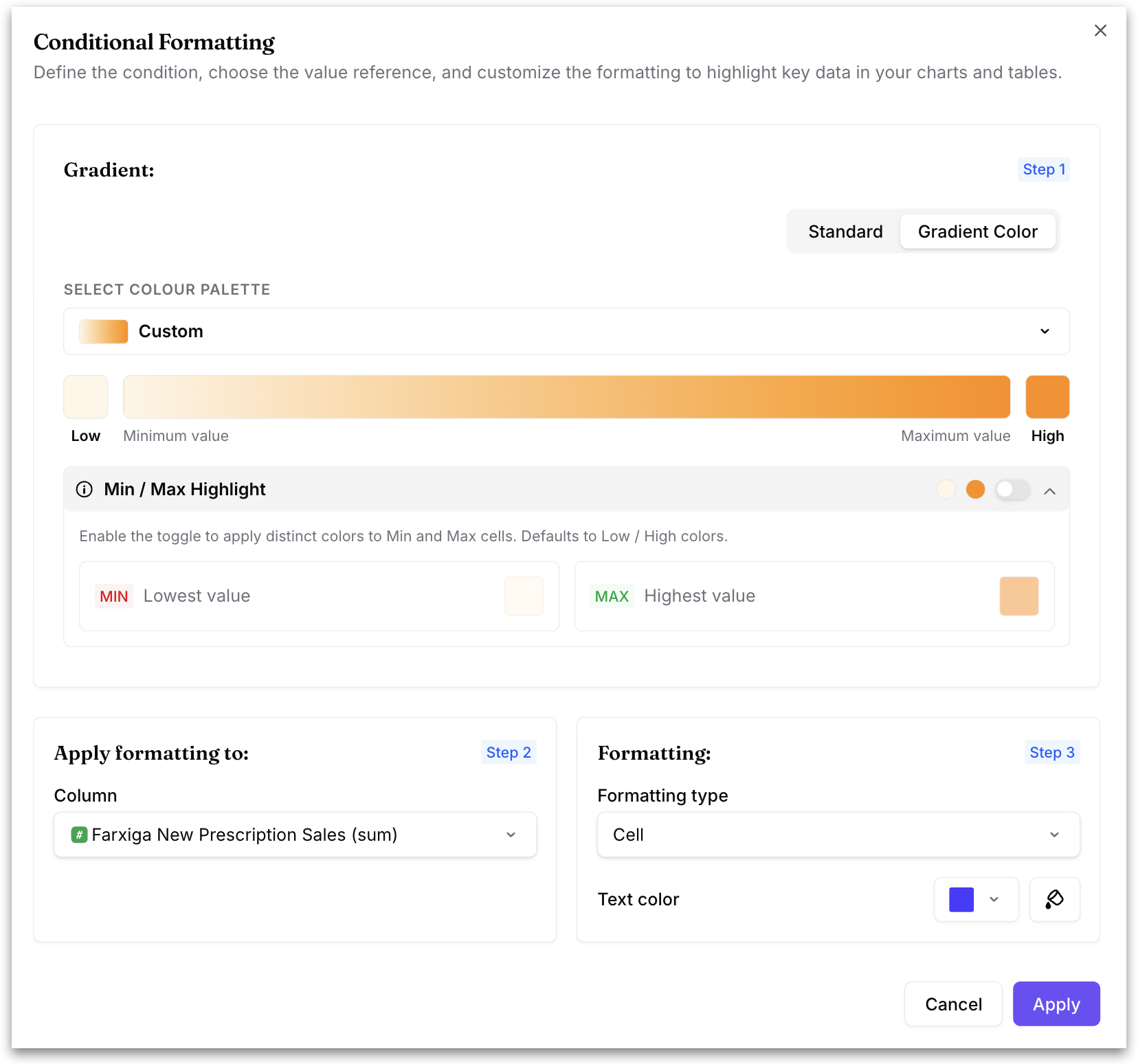
Select **Gradient Color** using the toggle in the top right of the rule builder. The dialog then shows three steps:
**Step 1: Gradient**
* **Select colour palette:** Choose the color range applied across your values. Choose **Custom** to set your own colors.
* **Low / High colors:** The gradient bar shows the color applied to the minimum value on the left and the maximum value on the right. With a **Custom** palette, click the color swatch at either end to change it.
* **Min / Max Highlight:** Enable this toggle to give the minimum and maximum cells their own distinct colors instead of the standard gradient ends. These default to the **Low** and **High** colors. When enabled, set a color for **MIN (Lowest value)** and **MAX (Highest value)** separately.
**Step 2: Apply formatting to**
* **Column:** Pick the column the gradient is applied to.
**Step 3: Formatting**
* **Formatting type:** Choose how the gradient is applied. **Cell** applies the gradient to each cell based on its own value, without changing the rest of the row. **Row** applies the gradient to the entire row based on the value in the selected column.
* **Text color:** Set the color of the text shown over the gradient, so values stay readable against darker shades.
Click **Apply** to save, or **Cancel** to discard.
#### Benchmark
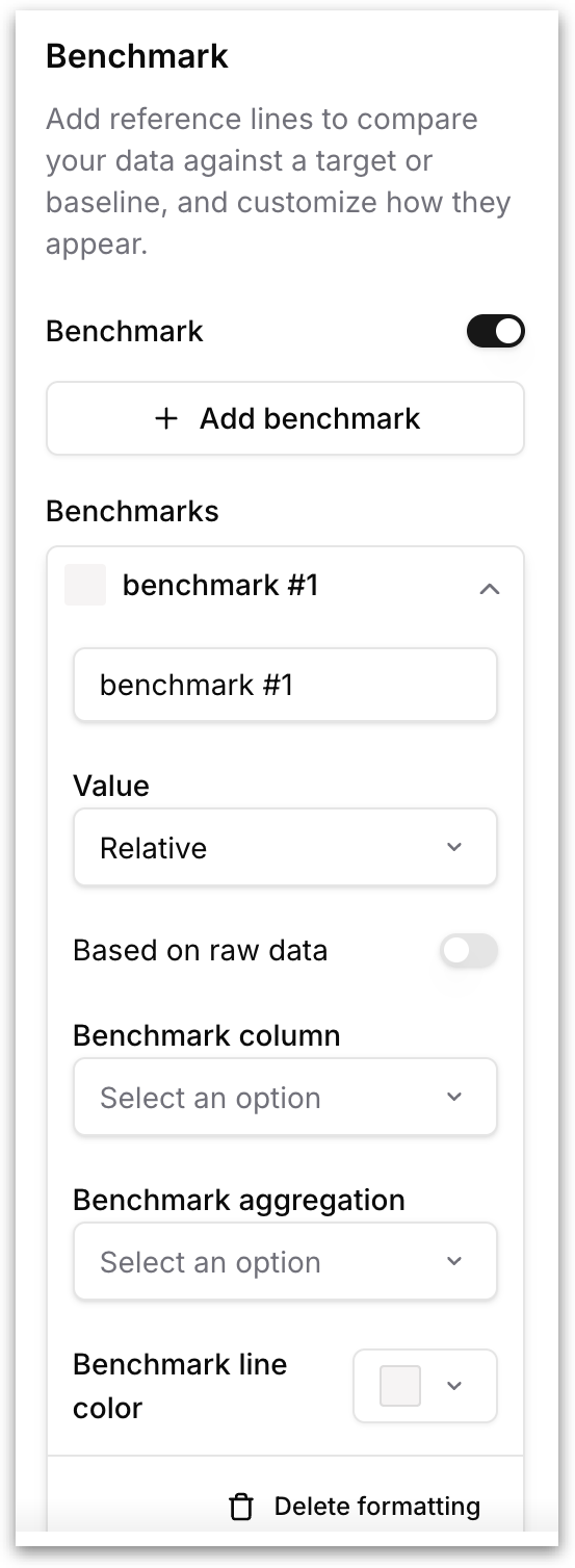
Add reference lines to your chart so you can instantly compare actual values against a target, baseline, or aggregate. Toggle **Benchmark** on to enable the feature, then click **+ Add benchmark** to create a new reference line.
* **Name:** Edit the label that appears on the chart next to the reference line.
* **Value:** Choose how the benchmark value is determined. *Relative* calculates the benchmark from the chart's own data (using the column and aggregation you specify below) and *Fixed* lets you to input the value. Use **Relative** when you want the line to move with the data.
* **Based on raw data:** When enabled, the benchmark is computed from the raw, unaggregated dataset rather than from the already-aggregated values visible in the chart. Enable this when the chart's aggregation (say, a grouped sum) would distort the benchmark.
* **Benchmark column:** Select the measure column the benchmark should be calculated from.
* **Benchmark aggregation:** Choose the aggregation function applied to the selected column.
* **Benchmark line color:** Pick the color of the reference line so it stands out against the chart's data series.
Click **Delete formatting** at the bottom of a benchmark card to remove it. You can add multiple benchmarks to a single chart and each can use a different column, aggregation, and color.
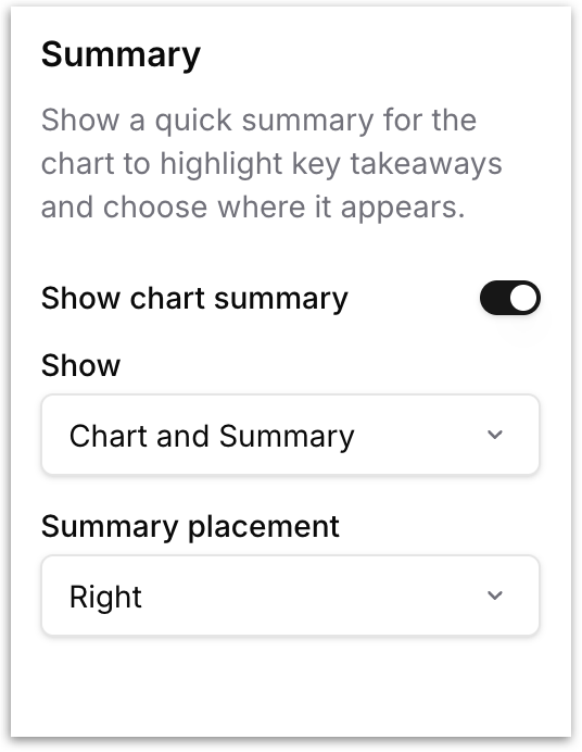
**Summary** **(only available in Edit mode formatting):** Displays a quick summary alongside the chart to surface key takeaways. Toggle **Show chart summary** to enable it, then configure:
* **Show:** Choose what to display. *Chart and Summary* shows the table and the summary side by side. *Only the Summary* hides the table entirely and shows just the summary.
* **Summary placement:** Choose where the summary appears relative to the table: *Right*, *Left*, *Top*, or *Bottom*.
## Table Formatting
* **Column:** Configure how column headers behave. The **Show aggregation as suffix** toggle, when enabled, appends the aggregation function to the column header (for example, *Revenue (sum)* instead of just *Revenue*). This is useful when a table contains the same column aggregated in multiple ways (sum and average of Revenue, for instance).
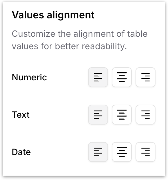
* **Values alignment:** Control the horizontal alignment of cell values by data type. Three alignment options (left, center, right) are available independently for each data type (numbers, text, date):
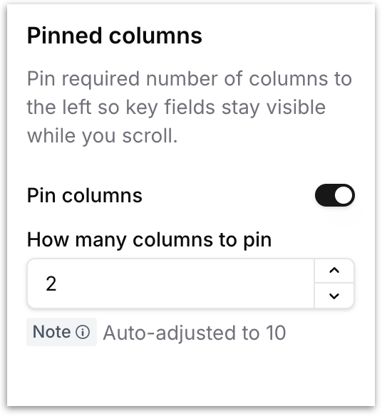
* **Pinned columns:** Freeze one or more columns to the left edge of the table so they remain visible while you scroll horizontally through the remaining columns. Toggle **Pin columns** to enable the feature, then set **How many columns to pin** (auto-clamped to a maximum of 10). The leftmost columns in the table will be pinned as per the given number.
---
# Agent Instructions
This documentation is published with GitBook. GitBook is the documentation platform designed so that both humans and AI agents can read, navigate, and reason over technical content effectively. Learn more at gitbook.com.
## Querying This Documentation
If you need additional information that is not directly available in this page, you can query the documentation by asking a question.
Perform an HTTP GET request on the following URL with the `ask` and `goal` query parameters:
```
GET https://help.tellius.com/vizpads-explore/actions-in-view-mode/formatting.md?ask=&goal=
```
`ask` is the immediate question: it should be specific, self-contained, and written in natural language.
`goal` is what the user is ultimately trying to achieve, the reason they need the answer. Sharing it helps GitBook give you a better, more relevant answer. A goal is most helpful when it describes the outcome the user wants rather than restating the question. For example, with `ask=how do I create an API token`, a goal like `automate deployments from our CI pipeline` lets GitBook tailor the answer to that use case.
The response will contain a direct answer to the question and relevant excerpts and sources from the documentation.
Use this mechanism when the answer is not explicitly present in the current page, you need clarification or additional context, or you want to retrieve related documentation sections.