📝Actions in Edit mode
Explore actions in Edit Mode in Tellius Vizpads—add charts, apply filters, customize visuals, and manage Business Views for flexible, interactive analytics.
There are two ways in which you can access Vizpad in Edit mode.
Creating a new Vizpad
Editing an existing Vizpad
Creating a new Vizpad
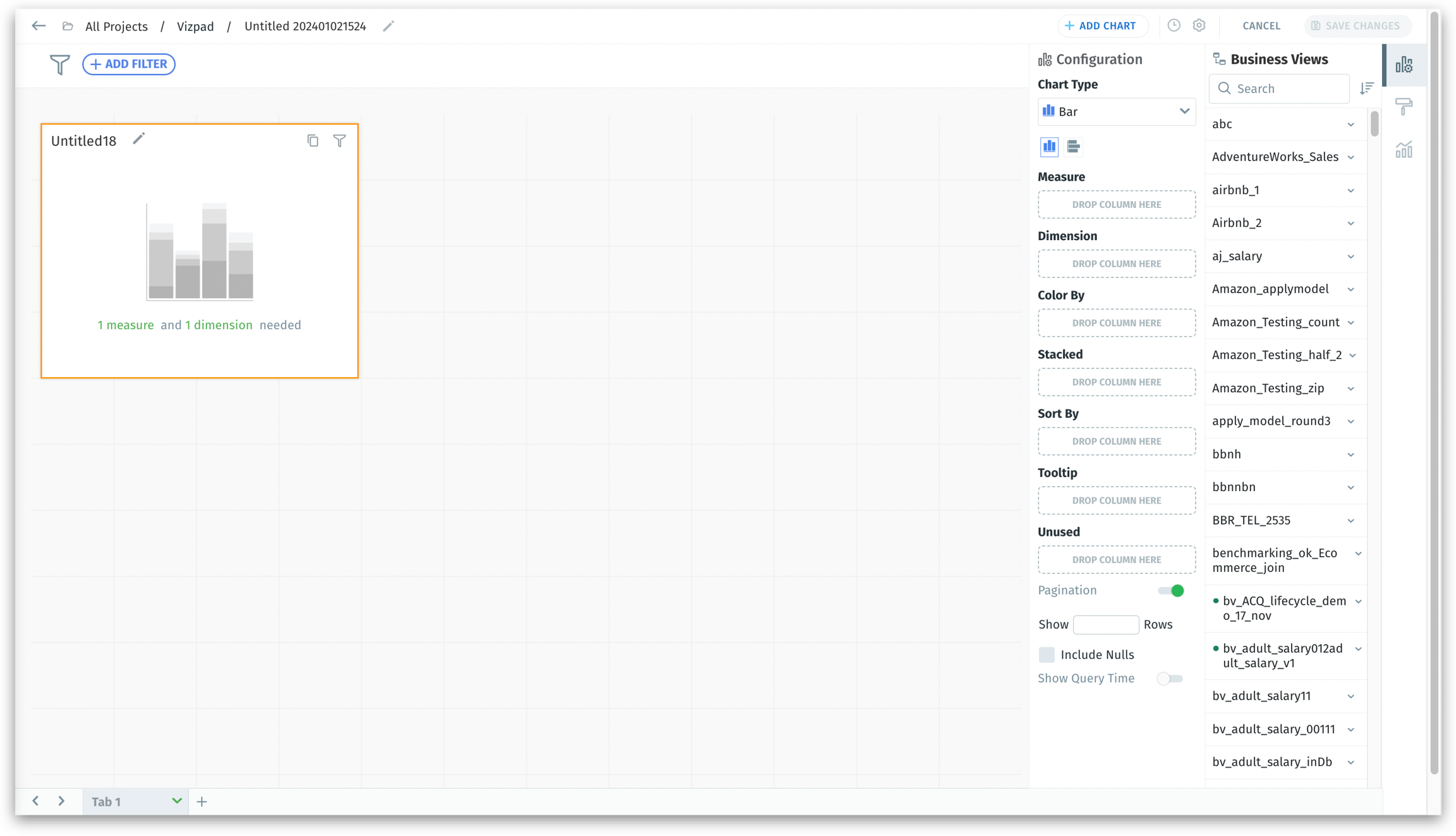
Click on Explore on the left pane and click on the plus (Create new Vizpad) sign. You will be redirected to a blank canvas shown below:
Editing an existing Vizpad
Click on Explore on the left pane. The existing Vizpads will be displayed. Select any required Vizpad that needs to be edited, and you will be able to view the screen shown below:
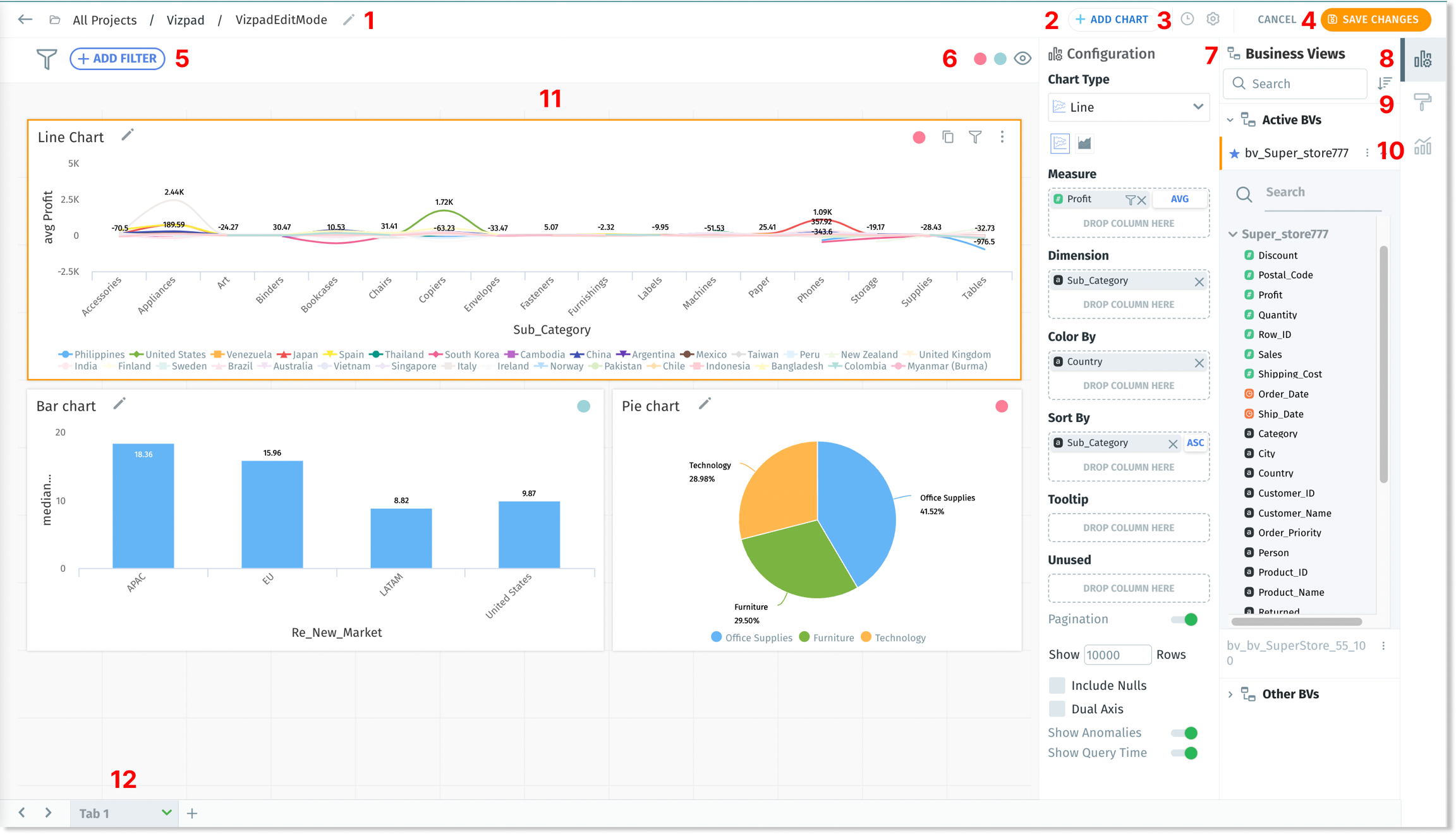
Both of the above screens are similar except for the presence of charts in an existing Vizpad. Let's break down the components found on the above screen.
To ensure secure and controlled access, only users with the appropriate permissions are authorized to create and/or edit Vizpads.
Vizpad name
Displays the current location within the Vizpad as "All Projects / Vizpads / [Vizpad Name]". To rename the Vizpad, click on the pencil icon adjacent to the Vizpad name. Click on <- to go back to the page that displayed all existed Vizpads.
Unsaved changes in a Vizpad will be lost if you navigate away before saving. Always save your Vizpad to retain any edits made.
Add chart
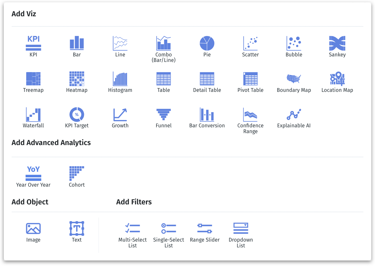
Click this button to include various chart types in a Vizpad. Tellius supports a comprehensive range of charts, including standard, advanced, and customizable objects like images and text, alongside control filters such as single-select, multi-select, range sliders, and dropdown lists.
The following window will be displayed on clicking the Add Chart button:
Show query time
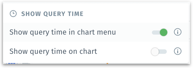
Enabling the toggle will display the time taken to load each chart within the Vizpad, visible on top of each chart and/or within the menu of each chart. For more details, check out this page.
Settings menu
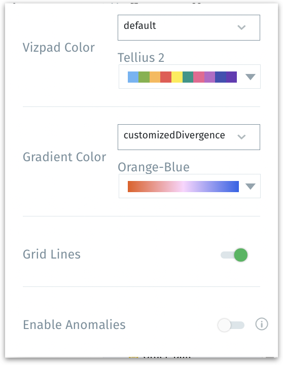
Vizpad Color: Customize the overall color scheme of your Vizpad by selecting from a pre-defined palette. The following options will be displayed:
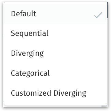
Gradient Color: For charts that require a color gradient, such as heat maps or gradient scales, you can select a two-tone gradient under "Gradient Color". Choose from the options below to view different color palettes.
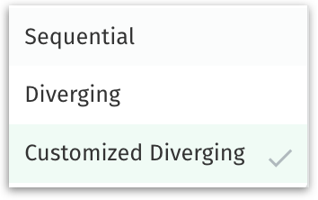
Gradient color is a gradual blend between two or more colors, often used to represent a range of values or to denote intensity, whereas Vizpad color refers to the overall color theme of the Vizpad.
Grid Lines: This toggle allows you to turn on or off the grid lines in your charts. Grid lines can help guide the eye and improve the readability of charts, but they can be disabled if a cleaner look is desired.
Enable Anomalies: When this option is enabled, data points that are considered anomalies will be highlighted in line charts. Anomalies are data points that deviate significantly from the standard data patterns and could indicate important insights or errors.
Save changes
Click on Save changes to retain the changes made in the Vizpad. Else, click on Cancel to revert.
Please note that changes will be reflected in the Vizpad only after you click on Save changes.
Add filter
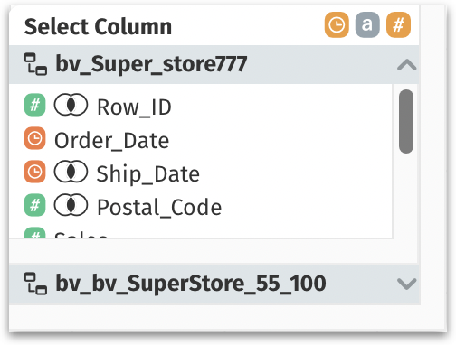
This is a global filter and any filter set up here will get reflected across all the charts (Viz) in the Vizpad. Click on the button to begin setting up filters, and all the columns of active Business Views used in the Vizpad will be displayed. For more details, check out the Filters section on this page.
Business View legend
The Business View used in each chart in a Vizpad can be identified using the legend displayed near the 👁️ icon. Each color represents a different Business View used in the Vizpad.

The colors can be shown or hidden when you click on the 👁️ icon. When you hover over the circle of color (in the top right corner of a chart/Vizpad), the name of the associated Business View will be displayed in the tooltip.
List of Business Views
This section displays the list of existing Business Views. You can search for the required Business View and sort the order of display (ascending/descending) based on Business View names.
The Business View that was used to create the first chart in a Vizpad becomes the default Business View, and it’s represented with a ⭐ near its name.
When you select a chart, only the associated Business View is enabled.
The Business Views used for the Vizpad will be listed under Active BVs. All the other available Business Views listed under Other BVs are disabled since you’ll be able to add columns to a chart from only one active Business View.

Configuration
Here, you can build charts by dragging and dropping (or double-clicking on) the required columns from the selected Business View. Enhance the charts further by applying aggregation and filters in multiple fields.
For more details, check out this page.

Formatting
The charts can be customized with a variety of formatting options in this section. Adjust colors, modify font styles and sizes, and explore additional formatting features for your charts. For more details, check out this page.

Advanced Analytics
This tab is applicable only for selected charts. Here, you can apply Y-axis target lines and benchmark for the charts. For more details, check out this page.
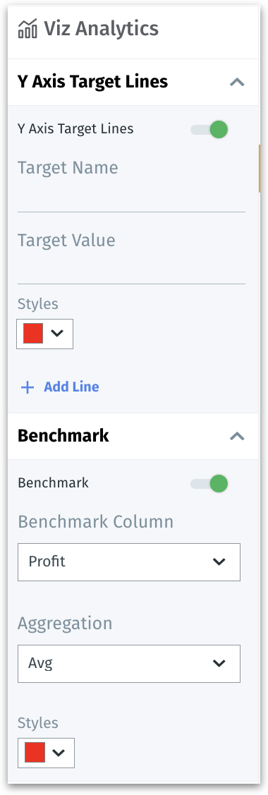
Chart canvas
This is the canvas where every chart (Viz) added will be displayed. The charts can be resized and arranged in the layout as per your preferences. A tab of a Vizpad can have a maximum of 25 Viz.
Tabs
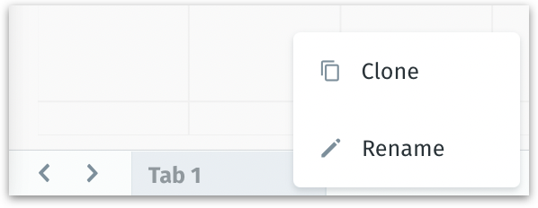
Here, you can navigate the multiple tabs of a Vizpad. A Vizpad can have a maximum of 10 tabs.
Click on the dropdown of a tab to clone or rename it. Click on the "+" icon to add a new tab.
Switch Metric
Switch Metric lets you replace a chart’s original measure with another measure for quick analysis. This helps in exec reviews where you need to quickly see the results for a different KPI without modifying the original vizpad or creating duplicates.
Click on Switch Metric in the top right, near the Configuration pane. The following window will be displayed.
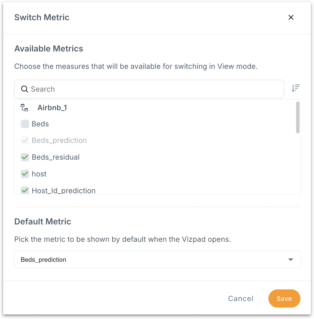
Under Available metrics, choose the measures which needs to be shown in Vizpad view mode for users to switch the metric.
Under Default metric, choose the measure that should load by default when you open the Vizpad.
The actual switching happens in View mode: users can swap the current measure to any of the Available metrics you configured. Here, in Edit mode, you can only configure the list of metric available for the switch.
Last updated
Was this helpful?