Tellius
  • ๐ŸšฉGetting Started
    • ๐Ÿ‘‹Say Hello to Tellius
      • Glossary
      • Tellius 101
      • Navigating around Tellius
      • Guided tours for quick onboarding
    • โšกQuick Start Guides
      • Search
      • Vizpads (Explore)
      • Insights (Discover)
    • โœ…Best Practices
      • Search
      • Vizpads (Explore)
      • Insights (Discover)
      • Predict
      • Data
    • โฌ‡๏ธInitial Setup
      • Tellius architecture
      • System requirements
      • Installation steps for Tellius
      • Customizing Tellius
    • Universal Search
    • ๐Ÿ Tellius Home Page
  • Kaiya
    • โ™Ÿ๏ธUnderstanding AI Agents & Agentic Flows
      • Glossary
      • Composer
      • ๐Ÿ—๏ธTriggering an agentic workflow
      • The art of possible
      • Setting up LLM for Kaiya
    • ๐ŸคนKaiya conversational AI
      • โ“FAQs on Kaiya Conversations
      • Triggering Insights with "Why" questions
      • Mastering Kaiya conversational AI
  • ๐Ÿ”Search
    • ๐Ÿ‘‹Get familiar with our Search interface
    • ๐Ÿค”Understanding Tellius Search
    • ๐Ÿ“Search Guide
    • ๐Ÿš€Executing a search query
      • Selecting a Business View
      • Typing a search query
      • Constructing effective search queries
      • Marketshare queries
    • ๐Ÿ”‘Analyzing search results
      • Understanding search results
      • Search Inspector
      • Time taken to execute a query
      • Interacting with the resulting chart
    • ๐Ÿ“ŠKnow your charts in Tellius
      • Understanding Tellius charts
      • Variations of a chart type
      • Building charts from Configuration pane
      • List of chart-specific fields
      • Adding columns to fields in Configuration pane
      • Absolute and percentage change aggregations
      • Requirements of charts
      • Switching to another chart
      • Formatting charts
      • Advanced Analytics
      • Cumulative line chart
    • ๐Ÿง‘โ€๐ŸซHelp Tellius learn
    • ๐Ÿ•ต๏ธโ€โ™‚๏ธSearch history
    • ๐ŸŽ™๏ธVoice-driven search
    • ๐Ÿ”ดLive Query mode
  • ๐Ÿ“ˆVizpads (Explore)
    • ๐Ÿ™‹Meet Vizpads!
    • ๐Ÿ‘‹Get familiar with our Vizpads
    • #๏ธโƒฃMeasures, dimensions, date columns
    • โœจCreating Vizpads
    • ๐ŸŒApplying global filters
      • Filters in multi-BV Vizpads
      • Filters using common columns
    • ๐Ÿ“ŒApplying local filters
    • ๐Ÿ“…Date picker in filters
      • Customizing the calendar view
    • โœ…Control filters
      • Multi-select list
      • Single-select list
      • Range slider
      • Dropdown list
    • ๐Ÿ‘๏ธActions in View mode
      • Interacting with the charts
    • ๐Ÿ“Actions in Edit mode
      • ๐Ÿ—จ๏ธViz-level actions
    • ๐Ÿ”งAnomaly management for line charts
      • Instance level
      • Vizpad level
      • Chart level
    • โณTime taken to load a chart
      • Instance level
      • Vizpad level
      • Chart level
    • โ™Ÿ๏ธWorking with sample datasets
    • ๐Ÿ”Swapping Business View of charts
      • Swapping only the current Vizpad
      • Swapping multiple objects
      • Configuring the time of swap
    • ๐Ÿค–Explainable AI charts
  • ๐Ÿ’กInsights (Discover)
    • ๐Ÿ‘‹Get familiar with our Insights
    • โ“Understanding the types of Insights
    • ๐Ÿ•ต๏ธโ€โ™‚๏ธDiscovery Insights
    • โž•How to create new Insights
      • ๐Ÿ”›Creating Discovery Insight
      • ๐Ÿ”‘Creating Key Driver Insights
      • ใ€ฐ๏ธCreating Trend Insights
      • ๐Ÿ‘ฏCreating Comparison Insights
    • ๐ŸงฎThe art of selecting columns for Insights
      • โžก๏ธHow to include/exclude columns?
  • ๐Ÿ”ขData
    • ๐Ÿ‘‹Get familiar with our Data module
    • ๐Ÿฅ‚Connect
    • ๐ŸชนCreate new datasource
      • Connecting to Oracle database
      • Connecting to MySQL database
      • Connecting to MS SQL database
      • Connecting to Postgres SQL database
      • Connecting to Teradata
      • Connecting to Redshift
      • Connecting to Hive
      • Connecting to Azure Blob Storage
      • Connecting to Spark SQL
      • Connecting to generic JDBC
      • Connecting to Salesforce
      • Connecting to Google cloud SQL
        • Connecting to a PostgreSQL cloud SQL instance
        • Connecting to an MSSQL cloud SQL instance
        • Connecting to a MySQL Cloud SQL Instance
      • Connecting to Amazon S3
      • Connecting to Google BigQuery
        • Steps to connect to a Google BigQuery database
      • Connecting to Snowflake
        • OAuth support for Snowflake
        • Integrating Snowflake with Azure AD via OAuth
        • Integrating Snowflake with Okta via OAuth
        • Azure PrivateLink
        • AWS PrivateLink
        • Best practices
      • Connecting to Databricks
      • Connecting to Databricks Delta Lake
      • Connecting to an AlloyDB Cluster
      • Connecting to HDFS
      • Connecting to Looker SQL Interface
      • Loading Excel sheets
      • ๐ŸšงUnderstanding partitioning your data
    • โณTime-to-Live (TTL) and Caching
    • ๐ŸŒทRefreshing a datasource
    • ๐ŸชบManaging your datasets
      • Swapping datasources
    • ๐ŸฃPreparing your datasets
      • ๐ŸคพActions that can be done on a dataset
      • Data Pipeline
      • SQL code snippets
      • โœ๏ธWriteback window
      • ๐ŸงฉEditing Prepare โ†’ Data
      • Handling null or mismatched values
      • Metadata view
      • List of icons and their actions
        • Functions
        • SQL Transform
        • Python Transform
        • Standard Aggregation
        • Creating Hierarchies
      • Dataset Scripting
      • Fusioning your datasets
      • Scheduling refresh for datasets
    • ๐ŸฅPreparing your Business Views
      • ๐ŸŒŸCreate a new Business View
      • Creating calculated columns
      • Creating dynamic parameters
      • Scheduling refresh for Business Views
      • Setting up custom calendars
    • Tellius Engine: Comparison of In-Memory vs. Live Mode
  • Feed
    • ๐Ÿ“ฉWhat is a Feed in Tellius?
    • โ—Alerts on the detection of anomalies
    • ๐Ÿ“ฅViewing and deleting metrics
    • ๐Ÿ–ฒ๏ธTrack a new metric
  • Assistant
    • ๐Ÿ’Introducing Tellius Assistant
    • ๐ŸŽคVoice-based Assistant
    • ๐Ÿ’ฌInteracting with Assistant
    • โ†–๏ธSelecting Business View
  • Embedding Tellius
    • What you should know before embedding
    • Embedding URL
      • ๐Ÿ“ŠEmbedding Vizpads
        • Apply and delete filters
        • Vizpad-related actionTypes
        • Edit, save, and share a Vizpad
        • Keep, remove, drill sections
        • Adding a Viz to a Vizpad
        • Row-level policy filters
      • ๐Ÿ’กEmbedding Insights
        • Creating and Viewing Insights
      • ๐Ÿ”ŽEmbedding Search
        • Search query execution
      • Embedding Assistant
      • ๐Ÿช„Embedding Kaiya
      • Embedding Feed
  • API
    • Insights APIs
    • Search APIs
    • Authentication API (Login API)
  • โœจWhat's New
    • Release 5.4
      • Patch 5.4.0.x
    • Release 5.3
      • Patch 5.3.1
      • Patch 5.3.2
      • Patch 5.3.3
    • Release 5.2
      • Patch 5.2.1
      • Patch 5.2.2
    • Release 5.1
      • Patch 5.1.1
      • Patch 5.1.2
      • Patch 5.1.3
    • Release 5.0
      • Patch 5.0.1
      • Patch 5.0.2
      • Patch 5.0.3
      • Patch 5.0.4
      • Patch 5.0.5
    • Release 4.3 (Fall 2023)
      • Patch 4.3.1
      • Patch 4.3.2
      • Patch 4.3.3
      • Patch 4.3.4
    • Release 4.2
      • Patch 4.2.1
      • Patch 4.2.2
      • Patch 4.2.3
      • Patch 4.2.4
      • Patch 4.2.5
      • Patch 4.2.6
      • Patch 4.2.7
    • Release 4.1
      • Patch 4.1.1
      • Patch 4.1.2
      • Patch 4.1.3
      • Patch 4.1.4
      • Patch 4.1.5
    • Release 4.0
Powered by GitBook

ยฉ 2025 Tellius

On this page
  • Title
  • Chart Colors
  • Conditional Formatting
  • Number Formatting
  • Data Labels
  • Axis Formatting
  • Grid Formatting
  • Legends
  • Background
  • Text Formatting (KPI target)
  • Text Formatting (tables)
  • Column Formatting

Was this helpful?

Export as PDF
  1. Search
  2. Know your charts in Tellius

Formatting charts

Fine-tune your chart's appearance with granular customizations.

PreviousSwitching to another chartNextAdvanced Analytics

Last updated 1 year ago

Was this helpful?

Click on the Formatting icon in the rightmost pane and the following panel will be displayed. This is the main control panel for customizing the appearance of your chart.

The "Reset to original" button allows users to revert all changes and return the chart to its default format. Click on the expand arrow button to expand the required section.

Title

The title section lets you modify the chart's title for clear identification.

Title Label: A toggle to enable or disable the title display in the chart with a text field for the title

Style: Dropdown menus to select the font style, size, and color for the title are provided.

Chart Colors

This section lets you choose the color scheme that will be used on the chart to differentiate data points or ranges.

Styles: Select from Default, Sequential, Diverging, Categorical, or Customized Diverging styles to match the data's narrative. Each style has its own unique palette and family of colors to choose from.

  • Default: Uses Tellius's standard color palette, offering a balanced range of hues that can be suitable for most data visualizations. It's designed to work well in a variety of contexts without any additional customization.

  • Sequential: Sequential palettes are designed for data that has an ordered progression, such as temperature or age ranges. Colors in a sequential style typically progress from light to dark or from less intense to more intense, indicating an increase in the value of the data.

    Reversed: Inverts the order of colors in the palette. For instance, if a sequential palette goes from light blue to dark blue, reversing it would start with dark blue and progress to light blue. This can be useful when the default progression of colors doesn't match the narrative you wish to convey with your data.

  • Diverging: Diverging color schemes are ideal for data that spans a neutral midpoint, such as deviations from a median value. Colors diverge from a neutral color into two extremes, usually contrasting hues, to highlight differences from the median or zero.

  • Categorical Style: Uses distinctly different colors to represent different categories within the data. It's best for nominal or categorical data where the data points are not ordered or related in a progressive manner.

  • Customized Diverging Style: Allows more control over the specific colors used on either side of the midpoint. This can be useful when you want to match specific brand colors or emphasize particular data points with chosen colors.

    Stepped Color: When activated, it breaks the color gradient into distinct steps or bands, rather than a smooth transition. This is especially useful for emphasizing specific ranges within the data by assigning a unique color to each range.

    Steps: Specify the exact number of color steps you want in your chart. For example, if you input "5", the gradient will be divided into five distinct color bands. This provides precise control over the granularity of the color coding, making it easier to distinguish between different data segments. Example: In a chart that shows population density, using stepped colors can clearly differentiate between densely and sparsely populated areas. If the range is set to 20 steps, you will have twenty distinct colors, each representing a specific population density range.

Conditional Formatting

Conditional formatting can be used to apply specific color codes to data points based on their values to highlight trends or outliers.

  • Enable the toggle to view the options, select the column to apply the formatting, and define the range (lower and upper bound). Example: To highlight the sales that fall into the 100 to 10,000 threshold bucket.

  • Color By: Pick a color that will be used to highlight all data points that fall within the 100 to 10,000 range (for example). This color choice will stand out against other data points for quick identification.

  • + Add formatting: If you need to create multiple conditions. Example: A second rule can be added to color lower-than-average sales in red.

  • Click on the trash icon near the color dropdown to delete the condition.

In the dropdown menus found in different formatting sections, the column currently utilized in the chart will be pre-selected by default.

Number Formatting

Customize how numbers are displayed in the chart, including formatting for currency, percentages, or plain numbers.

  • Custom Formatting: To enable number formatting options for your data.

  • Use the dropdown to select the "Sales" metric to apply formatting adjustments.

  • Separator: Select if you want a separator for thousands. Selecting "Yes (XXX,XXX)" will format numbers with commas for easier reading (Example: 10,000).

  • Decimals: Choose the number of decimal places you want to display. Selecting "2" will format numbers to two decimal places (Example: 1000.00).

  • Abbreviation: If your numbers are large, you can choose an abbreviation for thousands (K), millions (M), or billions (B).

  • Prefix and Suffix: Add text or symbols before (prefix) or after (suffix) the number. For example, selecting "None" for the prefix and "$" for the suffix will add "$" after the number to represent dollars.

Data Labels

This function allows you to enable or disable the display of data values on the chart.

  • On/Off: Enable or disable the display of data labels on the chart. When turned on, numerical values or category names will appear directly on the chart.

  • Styles: Customize the font style, size, color of data labels.

  • Show Data Marks: When activated, additional markers will be displayed on the chart, such as dots on a line (or area) chart, to denote exact data points. These can help pinpoint the precise value on the chart.

Axis Formatting

Here, you can define the appearance of both the X and Y axes' titles and labels.

  1. Axis Title:

    • X-axis Title: This switch enables or disables the display of a title on the x-axis.

    • X-axis Title Text Field: Provide the title for the x-axis. Example: Order_Date.

    • Y-axis Title: This switch enables or disables the display of a title on the y-axis.

    • Y-axis Title Text Field: Provide the title for the y-axis. Example: avg Sales.

    • Styles: For both the x-axis and y-axis titles, you can define the font style, size, and color as per your requirements.

  2. Axis Labels:

    • X-axis Label: This section controls the display of labels along the x-axis. Turn the labels on or off, select the font style, size, color, and also specify the width of the labels to ensure they fit within the chart.

    • Y-axis Label: This section controls the display of labels along the y-axis. Turn the labels on or off, select the font style, size, color, and also specify the width of the labels to ensure they fit within the chart.

Grid Formatting

This section provides options to display and format the grid lines on the chart. Grid lines can help users align and compare different points on the chart.

  1. X-Axis Grid Lines:

    • Toggle: This enables or disables grid lines along the x-axis.

    • Line Style: Select the desired line style (solid or longdash) for the x-axis grid lines for visual distinction.

  2. Y-Axis Grid Lines:

    • Toggle: This enables or disables grid lines along the x-axis.

    • Line Style: Select the desired line style (solid or longdash) for the y-axis grid lines for visual distinction.

  3. Y-Axis Ticks:

"Ticks" refer to the small lines or markers on the axis that denote specific values or intervals.

  • Toggle: Show or hide tick marks on the y-axis, which can serve as a reference point for specific values.

  • Numeric Input: Set the interval between each tick mark on the y-axis. By specifying a number, you can control the frequency and spacing of the tick marks, which correspond to the values on the y-axis. Example: If you are visualizing data ranging from 0 to 100 and you set the y-axis ticks to "10", there will be a tick mark on the y-axis at every multiple of 10 (0, 10, 20, ..., 100), helping viewers to measuree the values of the data points on the chart more easily.

  1. Y-Axis Max/Min:

  • Toggle: These toggles allow you to lock the maximum and minimum values on the y-axis. When activated, the chart will be scaled to these specified values, which can be particularly useful for standardizing the view across multiple charts for comparison purposes.

  • Input Fields: These allow you to set the maximum and minimum values on the y-axis, providing control over the scale and range of the chart. This can be useful for focusing on a specific data range. Example: Consider a bar chart that shows quarterly revenue:

    • Set a maximum value (Y-axis Max) that is slightly higher than your highest data point to provide a clear view of the chart's upper limit. For example, if your highest quarterly revenue is approximately $3,900, you could set the maximum value at $4,000 to allow for a margin at the top of the chart.

    • For the minimum value (Y-axis Min), setting it just below the lowest data point can help in emphasizing the lowest revenue without excessive space at the bottom of the chart. If your lowest revenue is around $350, setting the minimum value to $300 could be appropriate.

Legends

The legends section controls the display of legends in a chart.

  • On/Off: This switch controls the visibility of the legend on the chart. When turned on, the legend will appear in the designated position.

  • Position: Select the position (top, bottom, right, left) where the legend will be placed on the chart.

  • Alignment: Sets the orientation (vertical or horizontal) of the legend items.

  • Sort Type: Set the order (ascending or descending) in which the legend items are displayed. If set to "Default", they are displayed in the order they are processed or appear in the dataset.

  • Styles: Customize the appearance of the legend text, including font style, size, and color.

Background

From the given dropdown, choose a color for the chart's background to enhance readability or match your company's branding.

Text Formatting (KPI target)

Under Text formatting, you can apply the following changes for the Measure used:

  • Value Style - Select the font style (normal, light, lighter, bold, bolder), font size and color for the numbers displayed.

  • Text - Provide a name to be displayed for the Measure.

  • Text Style - Select the font style (normal, light, lighter, bold, bolder), font size and color for the name provided under Text.

Enable Measure Aggregation to apply formatting to the aggregation word (e.g., avg, sum etc.). Provide the required font style, font size and color for the aggregation.

Under Connector, you can change the Connector text to be displayed (e.g., "of") and apply the required formatting (font style, font size and color) under Connector Text Style.

Enable Target Column/ Target toggle to apply the following formatting to the target columns used.

  • Value Style - Select the font style (normal, light, lighter, bold, bolder), font size and color for the numbers displayed.

  • Text - Provide a name to be displayed for the target column/target.

  • Text Style - Select the font style (normal, light, lighter, bold, bolder), font size and color for the name provided under Text.

Enable Target Aggregation toggle to apply formatting (font style, font size and color) to the aggregation word used for the target.

Under Layout Settings, you can apply the following changes to the label text displayed inside the donut of a KPI target chart.

  • Label Layout - Choose if you want the label text to be aligned in a Horizontal or Vertical manner.

  • Text Scaling - Choose if you want the label text to be changed relative to the size of the chart and length of the text (Auto-scale) or fixed based on the font size provided (User-defined).

Text Formatting (tables)

Text formatting allows you to customize the appearance of headers and values found in tables and detailed tables.

Headers: Choose the font style, size, and color for the text used in table headers.

Values: Choose the font style, size, and color for the text used in the body text.

Column Formatting

The toggle "Show aggregation as suffix", when enabled, will append the aggregation type (such as sum, average, count, etc.) to the end of the numeric value in the column. This section can be found in pivot tables.

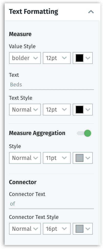
Text formatting for KPI target charts
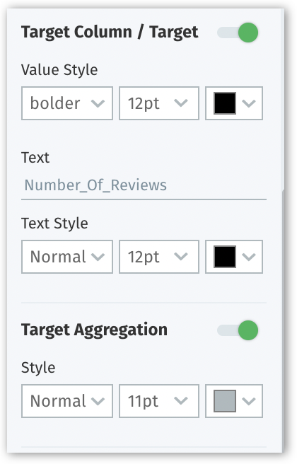
Formatting the target column
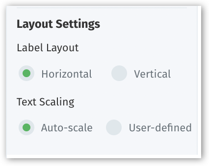
Formatting the label layout
๐Ÿ”
๐Ÿ“Š
Applying text formatting for target values in KPI charts
Applying layout setting for the text in KPI target charts
Formatting panel
Title formatting
Chart colors section
Line chart in default color palette
Line chart in sequential color palette
Heatmap in sequential color palette
Heatmap in diverging color palette
Line chart in categorical color palette
Treemap in customized divergence color palette
Conditional formatting
Number formatting
Data labels
Axis formatting
Grid formatting
Legend formatting
Background color
Text formatting
Column formatting
Applying text formatting for KPI target charts