Formatting pivot table
Enable advanced pivot tables to explore data hierarchies, apply rich conditional formatting, and uncover trends with dynamic, drill-down insights.
Enabling advanced pivot tables
In Vizpads, select the required pivot table and navigate to Configuration and enable the "Use Advanced Pivot" toggle.
The new pivot table displays data in a tree-like hierarchical structure that supports unlimited nesting levels. You can create hierarchies like Region → State → City → Product, with each level independently expandable.
Click expand/collapse arrows to show or hide detail levels. Your expansion choices remain intact during filtering and sorting.
The advanced pivot automatically calculates rollup totals at each hierarchy level (so you can see regional performance alongside state-level detail). Row totals show aggregations for parent categories, while column totals provide summaries across time periods or metric dimensions.
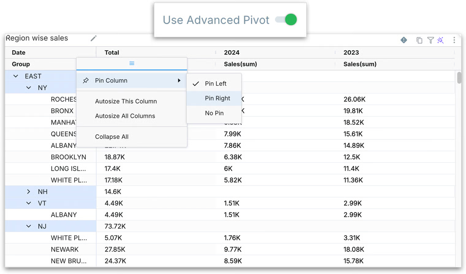
Column management
Click on the header column (the hamburger menu) of any pivot table and the following menu will be displayed.
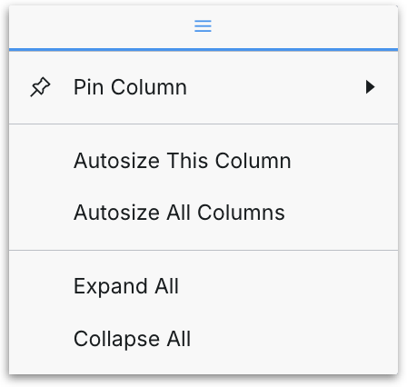
Pin Column: Pin critical columns to the left or right side so they remain visible during horizontal scrolling.
Use "Collapse All" to collapse all the branches and "Expand all" to expand every branch.
Use "Autosize This Column" for individual column width adjustments or "Autosize All Columns" for all the columns adjustments.
Roll-ups and grand totals
Advanced Pivot tables now display aggregate totals at every level of your row and column hierarchy, not just at the lowest detail level. This means rollups and subtotals are visible for each grouping level (including collapsed groups) and grand totals appear at the top or bottom of the pivot for an overall summary.
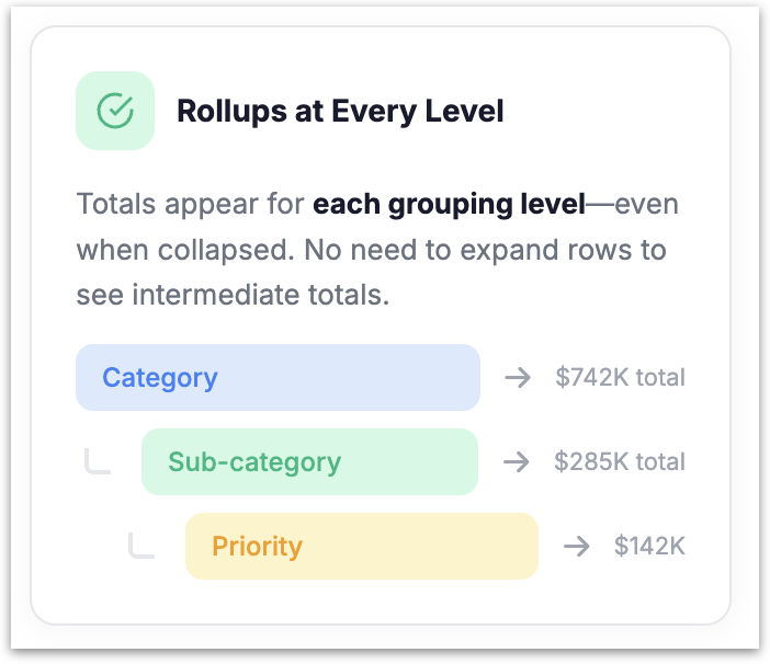
What this includes:
Rollups appear for each hierarchy level in your pivot. For example, if your row hierarchy is Category → Sub-category → Priority, you see totals at the Priority level, totals for each Sub-category (aggregating across its Priority values), and totals for each Category (aggregating across its Sub-categories). These rollups are visible even when higher-level groups are collapsed; you do not need to expand every row to see intermediate totals.
Row totals, column totals, and grand totals reflect the current pivot structure and all applied filters. If you change the pivot configuration or adjust filters, the totals update accordingly.
This works for common pivot aggregations including SUM (for example, Sales or Units) and AVG (for example, Average Discount or Average Profit). Intermediate totals appear where users expect them based on the aggregation type.
Example: Consider a pivot table where the row hierarchy is Furniture → Bookcases → High / Medium / Low priority, and the measure is Average Discount. Previously, collapsing the "Bookcases" row would hide the per-priority values without showing a Bookcases-level average. Now, even when Bookcases is collapsed, you see the average discount for Bookcases as a whole, the average discount for the Furniture category overall, and the grand total across all categories. No need to expand every sub-row or compute rollups manually outside the Vizpad.
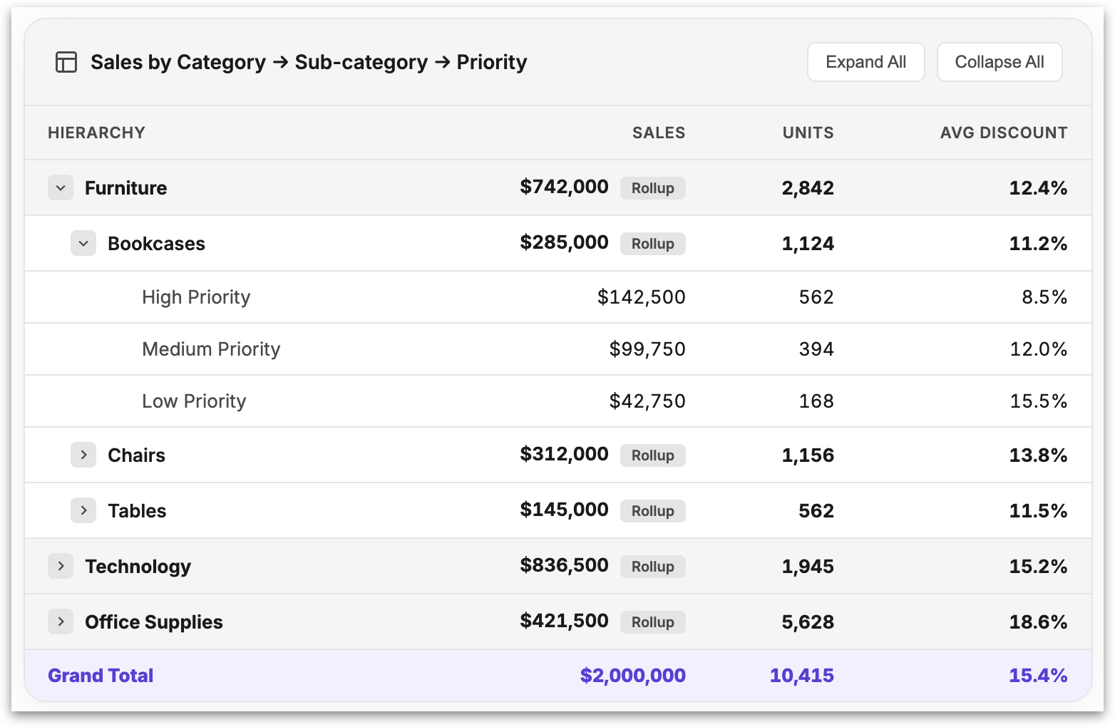
This is particularly valuable for reporting workflows where stakeholders need to compare totals at different levels (Region, Product group, Category) without drilling into every layer of the hierarchy.
Advanced Conditional Formatting
Select a pivot table and navigate Formatting → Conditional Formatting → Add Formatting, the following window will be displayed.
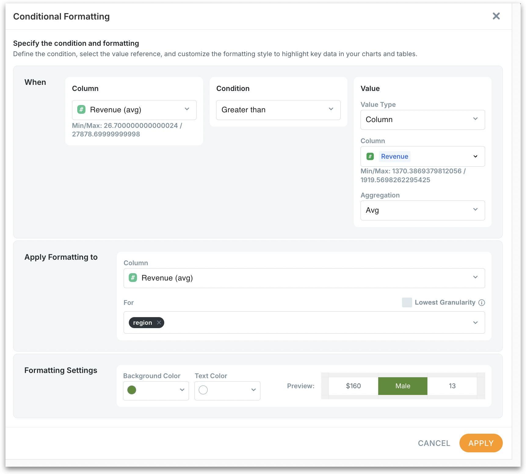
When section:
Column: Shows all available fields from current pivot table.
Min/Max value display: Shows data range (minimum and maximum) to help set appropriate thresholds.
Condition operators: Greater than, Less than, Equal to, Between etc.
Value type: Toggle between "Column" (dynamic comparison) and "Fixed value" (static number).

If using Column type, select from Viz Config fields or underlying Business View (BV) columns.
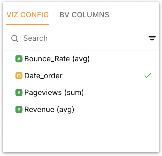
Viz Config
In Viz Config, you’ll only see the fields actively used in your current pivot—specifically, the metrics and dimensions you’ve selected for that chart or table.
BV Columns
The BV Columns tab shows all available fields from the underlying Business View or dataset, regardless of whether they're currently being used in your chart or table.
The BV COLUMNS option significantly expands your conditional formatting capabilities by allowing comparisons against any field in your dataset, not just those currently visible in your table. For example, you could format Revenue based on Customer_Segment even if Customer_Segment isn't displayed in your current table.
Aggregation control: Change aggregation method (Sum, Avg, Count) for the selected column.
Apply Formatting To section:
Target column selection: Choose which field receives the visual formatting
Granularity options: Define comparison scope with "Lowest Granularity" toggle
Dimension selector: When granularity disabled, choose specific dimensions for grouped comparisons
Lowest Granularity ON (Enabled): Tellius automatically uses all available dimensions in your chart/table to calculate comparison values. This creates the most detailed level of comparison possible.
Lowest Granularity OFF (Disabled): You manually select which dimensions to use for grouping the comparison calculation, allowing for more targeted benchmarking.
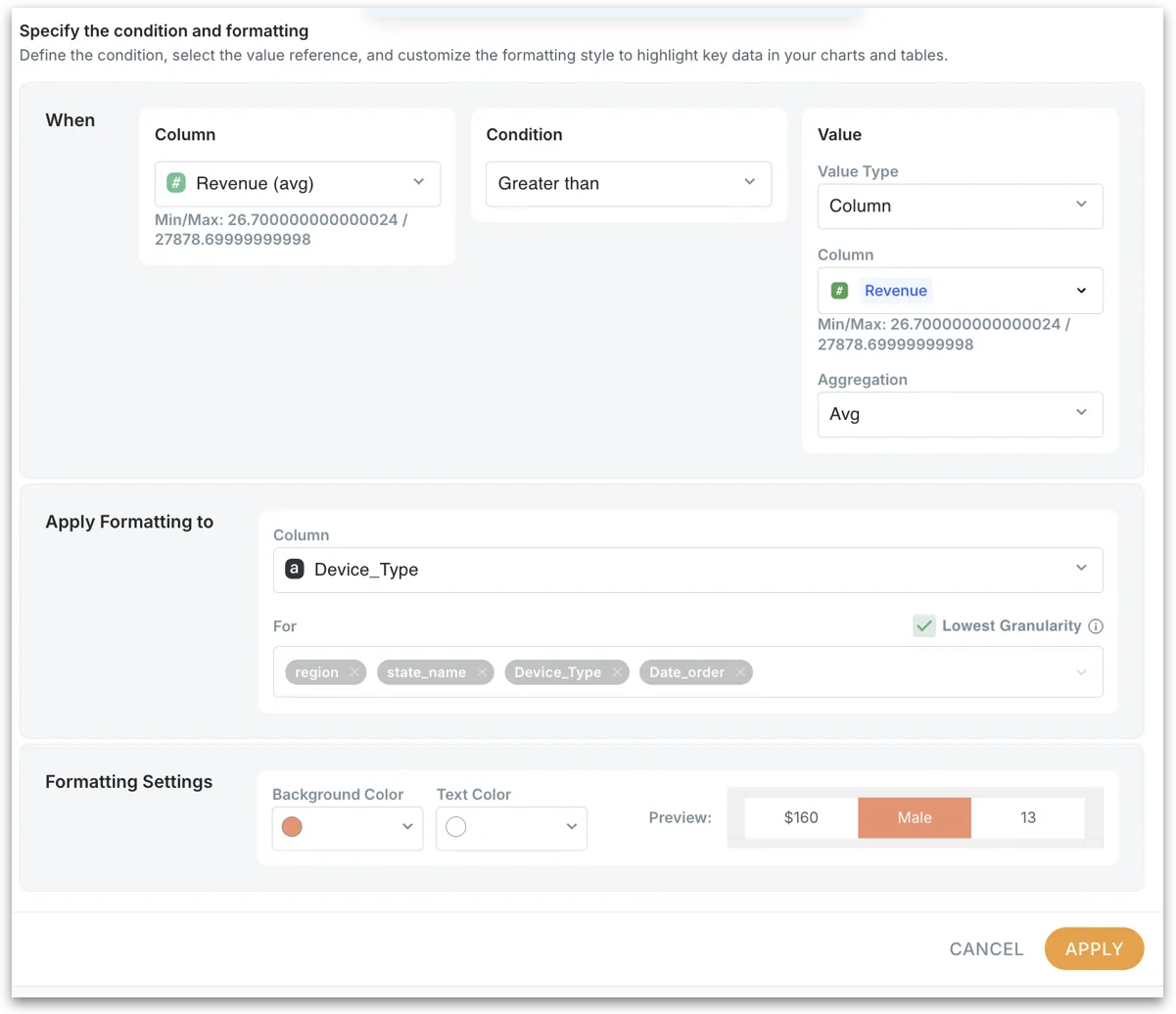
In the above example:
Automatically selects:
region,state_name,Device_Type,Date_orderCalculates average Revenue across all combinations of these dimensions
Compares each cell against the overall dataset average at the most granular level. Ideal when you want to compare against the entire dataset average
All available dimensions appear automatically in gray and you cannot modify the dimension selection
Example scenario: "Highlight any revenue value that's above the overall average across all regions, states, devices, and time periods"
Formatting Settings panel:
Choose Background Color and Text Color as required.
Right-side Preview panel shows the real-time preview showing how formatting will appear after applying changes.
All conditional formatting scenarios work on both old, new pivot tables AND regular tables.
Ways to leverage conditional formatting
Executive Dashboards: Automatically surface exceptions and outliers without manual monitoring. Revenue performance, customer engagement anomalies, and operational efficiency issues become immediately visible.
Territory Management: Compare rep performance against regional peers rather than global top performers.
Financial Analysis: Highlight budget variances, profit margin exceptions, and growth acceleration/deceleration patterns across business units and time periods.
Cross-column threshold formatting
Format one metric based on conditions in another metric. This is essential for highlighting relationships between different business measures. Quickly identify high-value segments with engagement issues that need immediate attention.
Surface cause⇄effect: style A when B crosses a target or its peer baseline.
Example: Highlight bounce rates when revenue exceeds $1,000
When: Revenue (avg) > 1000 (fixed value)
Apply formatting to: Bounce Rate
Result: Red background on bounce rates for high-revenue segments
Relative value formatting with granularity
Compare performance against appropriate peer groups rather than overall averages. This addresses the common problem where high-performing regions dominate global comparisons.
Fair context: State vs its Region—not the national outlier.”
Example:
Select the metric to evaluate (e.g., Revenue)
Choose "Greater than" condition
Set Value Type to "Column" and select the same metric
Disable "Lowest Granularity" to enable dimension-specific comparisons
Select granularity dimensions (Region, Product Category, etc.)
Apply formatting to highlight outperformers
A state might have lower revenue than California but significantly outperform other states in its region. This formatting highlights such relative success.
Period-over-period trend formatting
Automatically highlight period-over-period changes without manual calculation. Tellius compares each period to its immediate predecessor based on your data's time resolution (if "Monthly" resolution is selected, automatically compares month-to-month, compares day-to-day if "Daily" is selected and so on).
Instant momentum: detect dips and lifts at any slice.
Example applications:
Month-over-month growth: Green highlighting for improving metrics
Quarterly decline detection: Red highlighting for deteriorating performance
Seasonal pattern recognition: Consistent formatting reveals cyclical trends
Layering multiple rules
Tellius applies multiple formatting rules additively, creating rich visual hierarchies. For example,
Later rules override conflicting properties from earlier rules, but complementary properties stack (background + text color + font weight).
Formatting rules persist during data filtering and sorting. Rules automatically adjust to new granularity levels
Was this helpful?