Adding columns to fields in Configuration pane
Learn how to add and configure columns in Tellius charts—manage aggregations, filters, date groupings, sorting, and tooltips to refine every visualization.
Drag and drop the required columns from the Business View to any field of your choice. Alternatively, you can double-click the column to get it auto-filled in the next suitable field.
As you customize the fields in the Configuration pane, the results can be viewed in real-time in the chart.
After a column has been included in a field, it will have the following attributes:
Close button (X)
Every column in a field features a small "X" button. By clicking on this button, you can easily remove the column from the field.
Measures
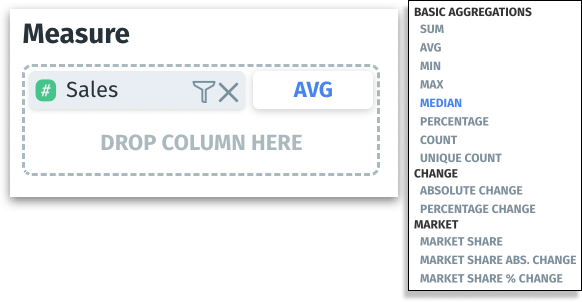
Aggregation label
Measure columns display an aggregation label. Click on the label to explore the full range of available aggregation options to modify how the data needs to be summarized.
Sum: Adds up all the numeric values within a selected measure.
Avg (Average): Calculates the mean value of the selected measure, offering a typical value when considering all data points
Min (Minimum): The smallest numeric value within a measure.
Max (Maximum): The largest numeric value within a measure.
Median: The middle value of a sorted measure, which can provide a better sense of the data's center point than the average if the data is skewed.
Unlike the mean (or average), the median is less influenced by these extreme values. Moreover, for datasets that might be skewed or not normally distributed, the median returns the value from the row that sits right in the middle, representing the 50th percentile of the dataset.
Percentage: The ratio of a part to the whole, expressed as a percentage.
Count: Tally of the number of values or entries within a measure.
Unique count: The number of distinct values in a measure.
Change: The difference between values in two points in a dataset, which is essential for trend analysis or measuring growth or decline.
Absolute change: Non-negative difference between values at two points.
Percentage change: Relative difference between two data points as a percentage.
Market share: Represents a segment's size relative to the total market, which is useful for competitive analysis.
Market share abs. change: Absolute change (growth or decline) of a market share over time.
Market share % change: Percentage change of a market share over time, which can indicate shifts in market dynamics or consumer behavior.
Filter
A filter icon appears next to the "x" icon for each measure added to a field, allowing you to narrow down or refine the data displayed in your charts.
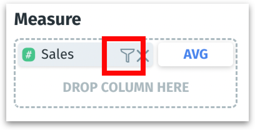
Clicking on this icon will open the filter window, as shown below.
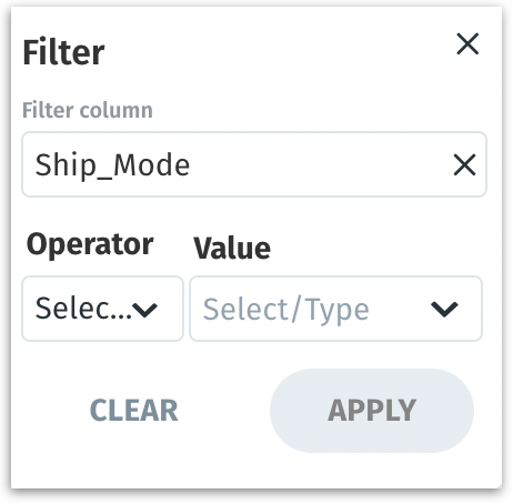
Filter Column: This dropdown allows you to select any column from the associated Business View to apply your filter.
Operator: The operator dropdown changes dynamically based on the type of column selected.
For measures - equals, does not equal, greater than, greater than or equal to, less than, less than or equal to, inbetween
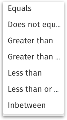
Operators for measures For dimensions - in, equals, compare
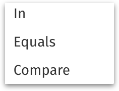
Operators for dimensions Value: Here you can input the specific value(s) you want to filter by, which can be typed in manually or selected from a list if applicable, depending on the filter and operator selected.
Clear: Resets the filter configuration, removing any selected values and operators from the current filter setup.
Apply: Activates the filter, applying the selected criteria to the chart to refine the data display according to your specified parameters.
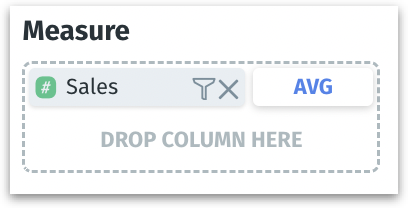
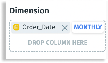
Date columns
Aggregation label
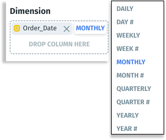
The aggregation options for date-related columns allow you to group your data based on different time intervals.
DAILY: Groups your data by individual days, providing insights on a day-to-day basis.
DAY #: It aggregates your data by the day of the month (1-31), which can be useful for identifying trends on specific days regardless of the month.
WEEKLY: Groups data by weeks, allowing for analysis of trends on a weekly cycle.
WEEK #: It aggregates data based on the week of the year (1-52), useful for comparing the same week across different years.
MONTHLY: Groups your data by each month, helpful for observing monthly trends and patterns.
MONTH #: It aggregates data by the month number (1-12), useful for seasonal analysis regardless of the year.
QUARTERLY: Groups data by quarters of the year, providing insights on a three-monthly basis.
QUARTER #: It aggregates data by the quarter of the year (1-4), which is beneficial for comparing performance across different years.
YEARLY: Groups your data by each year, ideal for observing long-term trends and year-over-year comparisons.
YEAR #: It aggregates data based on the year, which is useful for any longitudinal analysis where you need to look at the year as a discrete unit.
Tooltip
When a column is added to the Tooltip field, and if it is a measure then the aggregation label for measure (as described above) will be displayed. If the column added is a dimension, then the count aggregation will be displayed.
Count (for Dimensions)
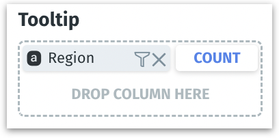
COUNT: Counts the number of entries or rows within a particular dimension.
UNIQUE COUNT: Counts the number of distinct entries within a particular dimension.
Sort By
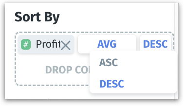
Two options (ascending and descending) will be displayed for columns added to Sort By field for sorting the column as required.
Was this helpful?